Interview by Josh Galarza | Artwork Documented by Gary Spector Photography, NYC
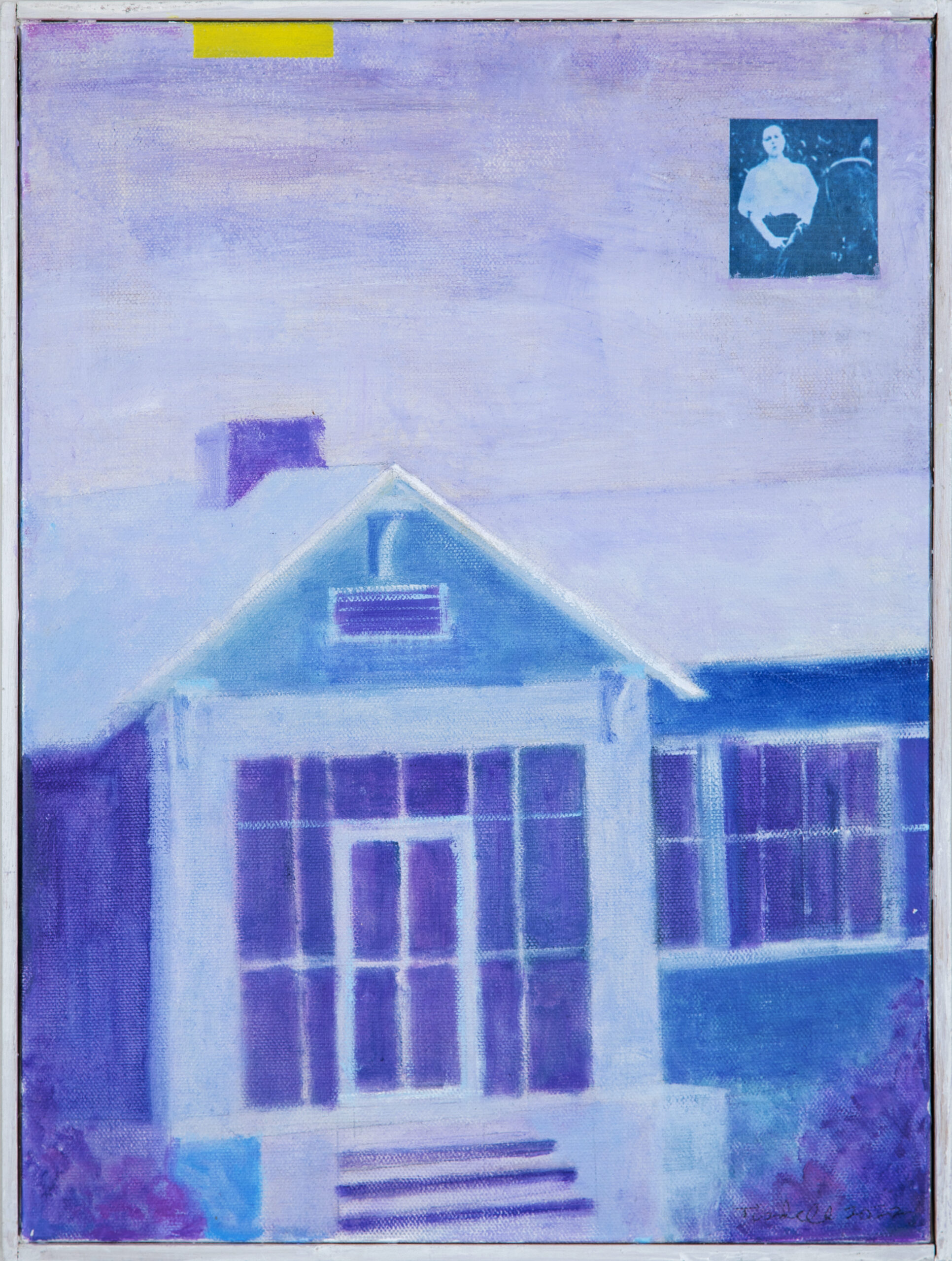
Perhaps because I’m a writer, the first thing I want to know about any artist is what motivates him. As I worked with Cliff Tisdell for this feature, I was struck primarily by his insatiable curiosity for the most grounded aspects of the world around him, particularly the experiences of ordinary people. Of his early artistic influences he states, “As a teen, George Segal’s plaster-cast bus drivers, parking garage attendants, and other characters connected to everyday urban life made a deep impression.” The works collected here, several interconnected pieces that constitute a portrait of Southern Gothic writer Carson McCullers, illustrate that Tisdell still values the most human—and most humane—aspects of even extraordinary lives. From the spaces that house us to the furry friends that bolster us to the colleagues who challenge or inspire us, Tisdell’s pieces both project McCullers’s life and reflect our own. Curiosity and focused attention make for a powerful combination in Tisdell’s works, which, in turn, provide plenty of small moments of profound impact to incite our own curiosity. I hope you’ll find your exploration of these images as rewarding as I have.
—Josh Galarza, Art Editor

In this poignant body of work, you pay homage to author Carson McCullers, whose varied catalog comprises lauded selections of fiction, creative nonfiction, drama, and poetry. You’ve told me that you hope to bring her story and work to the attention of new generations of readers. How would you introduce McCullers to the uninitiated? What would you like your viewers to know about her life?
McCullers was a unique American voice, way ahead of her time. A huge talent, only twenty-one when she wrote The Heart is a Lonely Hunter. She took on themes of race, sexuality, and gender in America. Several of her novels were adapted into major films and plays.
If I were to make recommendations for an intro to McCullers, some of my favorites are the short stories “Wunderkind” and “The Aliens,” and the novel The Member of the Wedding. My favorite film adaptation of a McCullers story is Reflections in a Golden Eye with Marlon Brando and Elizabeth Taylor. Hollywood’s 1950s version of The Member of the Wedding with Julie Harris and Ethel Waters is available on YouTube. There’s also a 1991 film adaptation of The Ballad of the Sad Cafe with Vanessa Redgrave on Netflix.
What circumstances in your own life led you toward McCullers? And what aspects of her work and life were most important for you to illustrate visually?
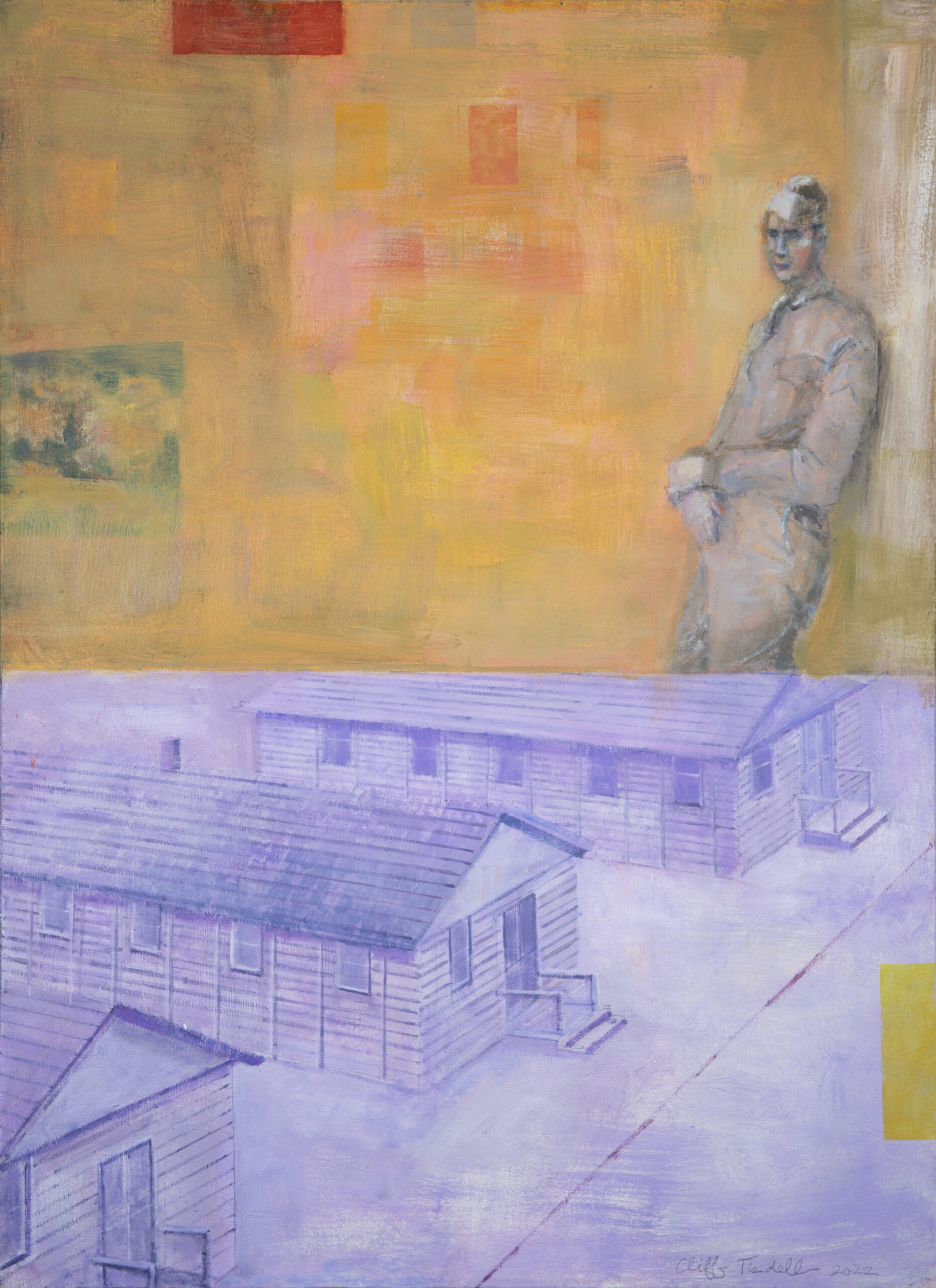
My introduction to McCullers occurred when I was a teen. I saw director John Huston’s 1967 Reflections in a Golden Eye. Adapted from McCullers’s second novel, she co-wrote the screenplay. Controversial at the time, the film focuses on a repressed army colonel, played by Marlon Brando, harboring fantasies about a young GI. Brando’s performance left an impression on me. Decades later, I came upon McCullers’s house in Nyack, New York, where she lived for the last twenty-three years of her life.
Then in 2019, while preparing an exhibit for the Hopper House, which is blocks away from McCullers’s house, I became intrigued by her gothic house overlooking the Hudson River. The young curator I was working with at the Hopper House shared a fascination with McCullers. We talked about how remarkable yet underappreciated she was. Reading her body of work, I was taken by her early brilliance, her gifts as a writer, her roots in the Deep South, her journey to New York, and how timely the themes of race and gender are that run through her stories. There were things going on with my work that related to McCullers at the time. I had been doing Women in Trouble paintings and figurines, and I was working with a gallery in Charleston.

When you first endeavored to honor McCullers in your work, you hit a creative roadblock. Can you take me through those challenges and the breakthrough that led to your success?
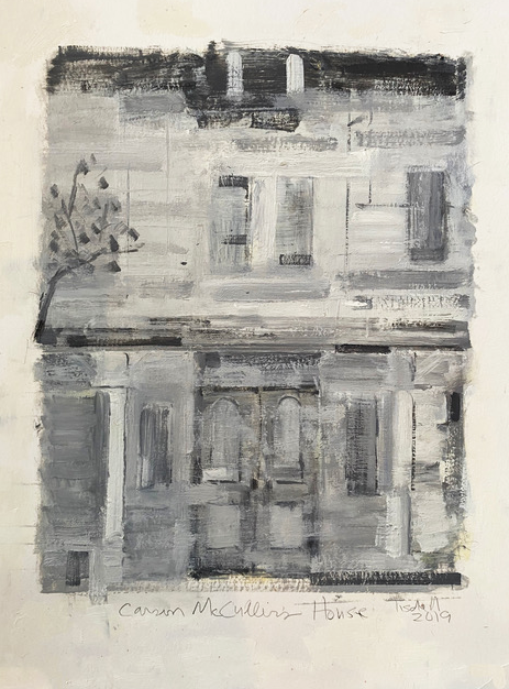
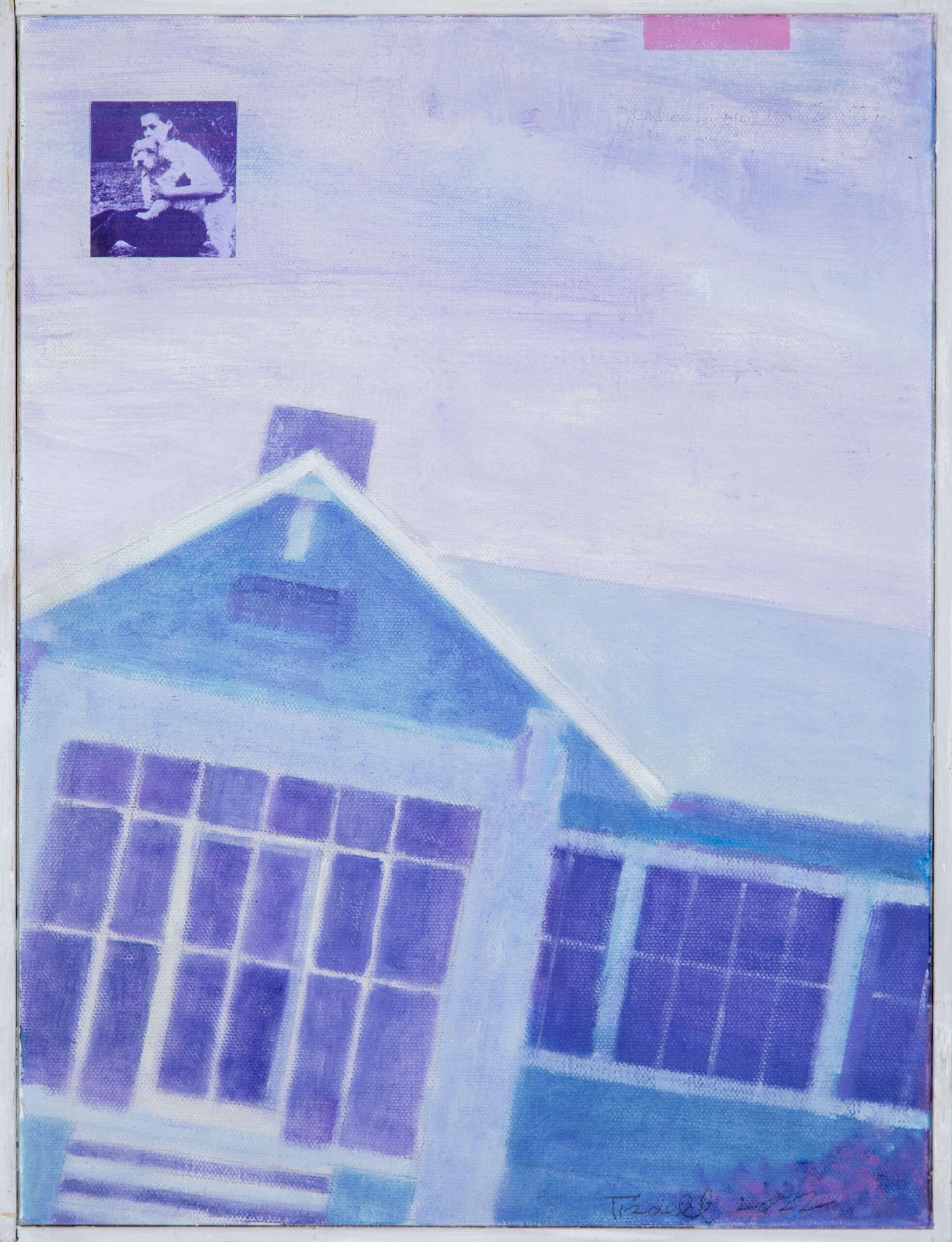
Originally, I did some plein air paintings of McCullers’s home, but wasn’t happy with the results. They were too conventional, so I put the idea aside. About a year later, while the pandemic lingered on, shut inside my studio looking for ideas to paint, I returned to the subject of McCullers. I made more visits to the house, this time taking photos from many angles. I realized I could use architecture as a way to emphasize the psychological, like in early German expressionist film. This cinematic approach to painting McCullers’s house provided me with a portal to enter McCullers’s world. From there, more ideas and McCullers paintings flowed.
What aesthetic, tonal, or thematic parallels between McCullers’s writing and your paintings emerged as you crafted this body of work?
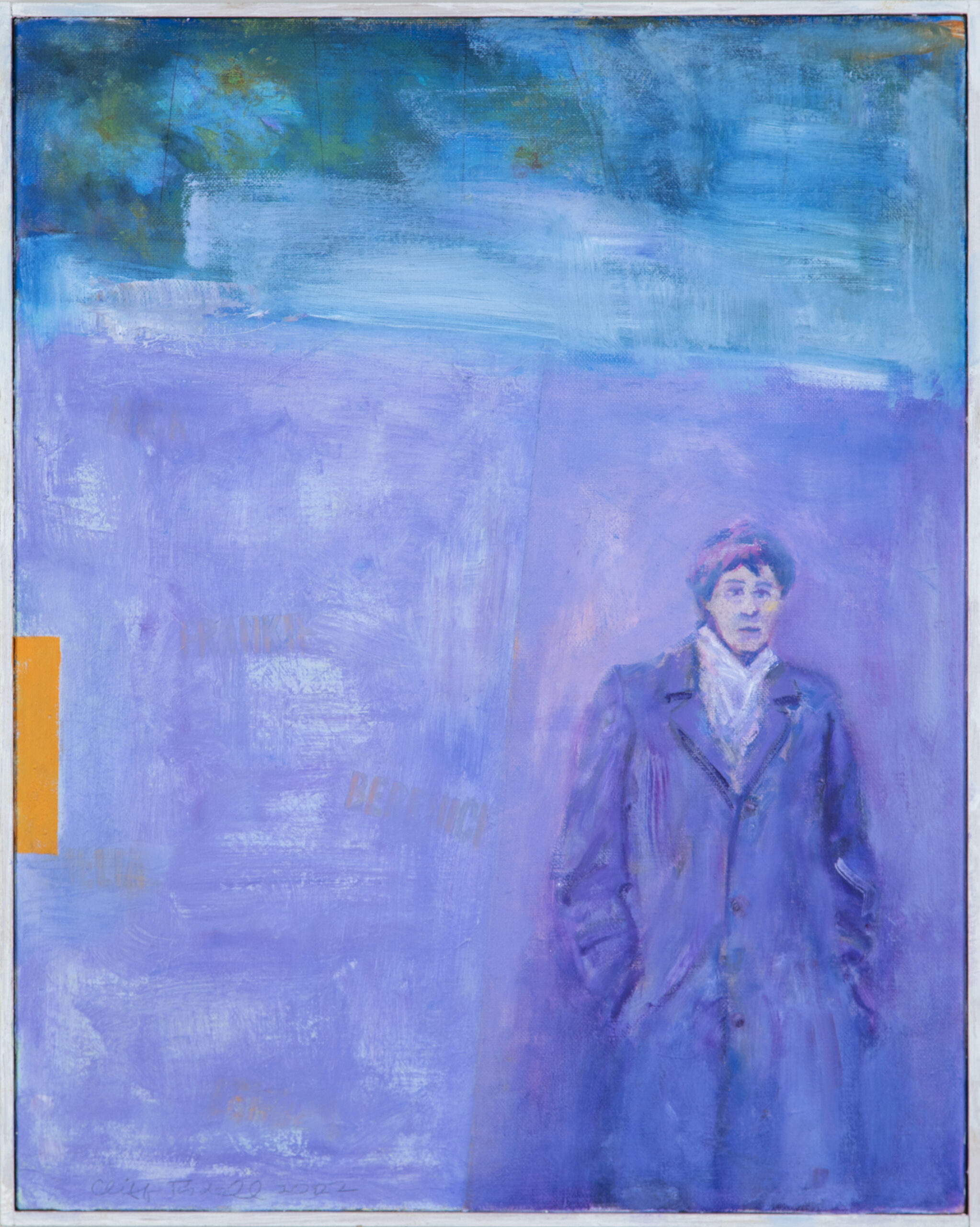
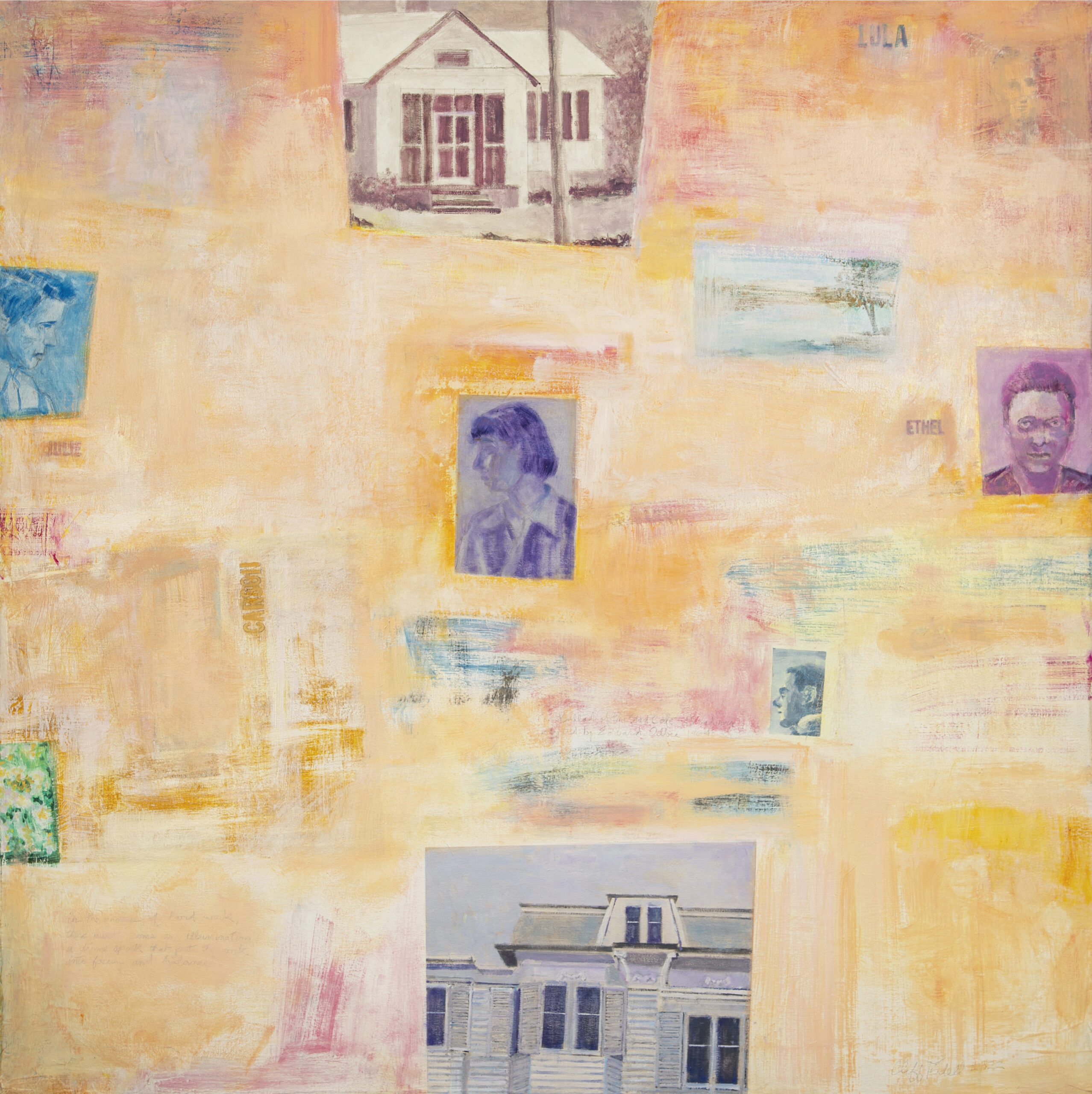
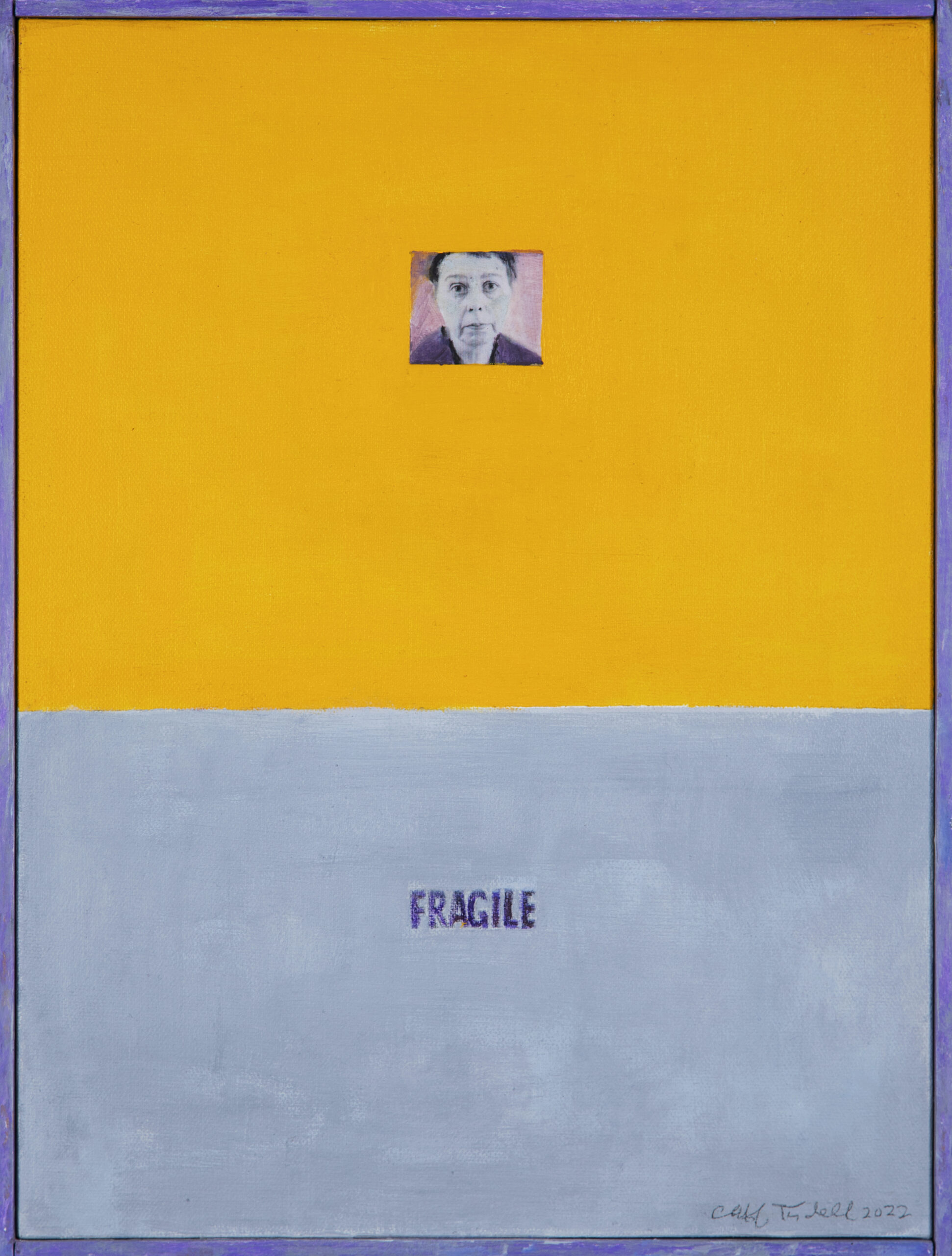
There’s an emphasis on powerful women. I wanted to show McCullers primarily as a young, gifted, androgynous woman. Although she was weak in body, I tried to convey her inner strength. Only one painting in the series, Fragile, shows McCullers late on, ravaged by life. Additionally, interpretations of Frankie [the tomboy protagonist in McCullers’s 1946 novel, The Member of the Wedding] appear, and in one painting I reimagine Berenice, the servant from The Member of the Wedding, as a younger, more elegant woman.
McCullers spoke about divine sparks of “illuminations.” I love this description of the creative process. It’s a theme I attempt to convey with abstract shapes and luminous color.
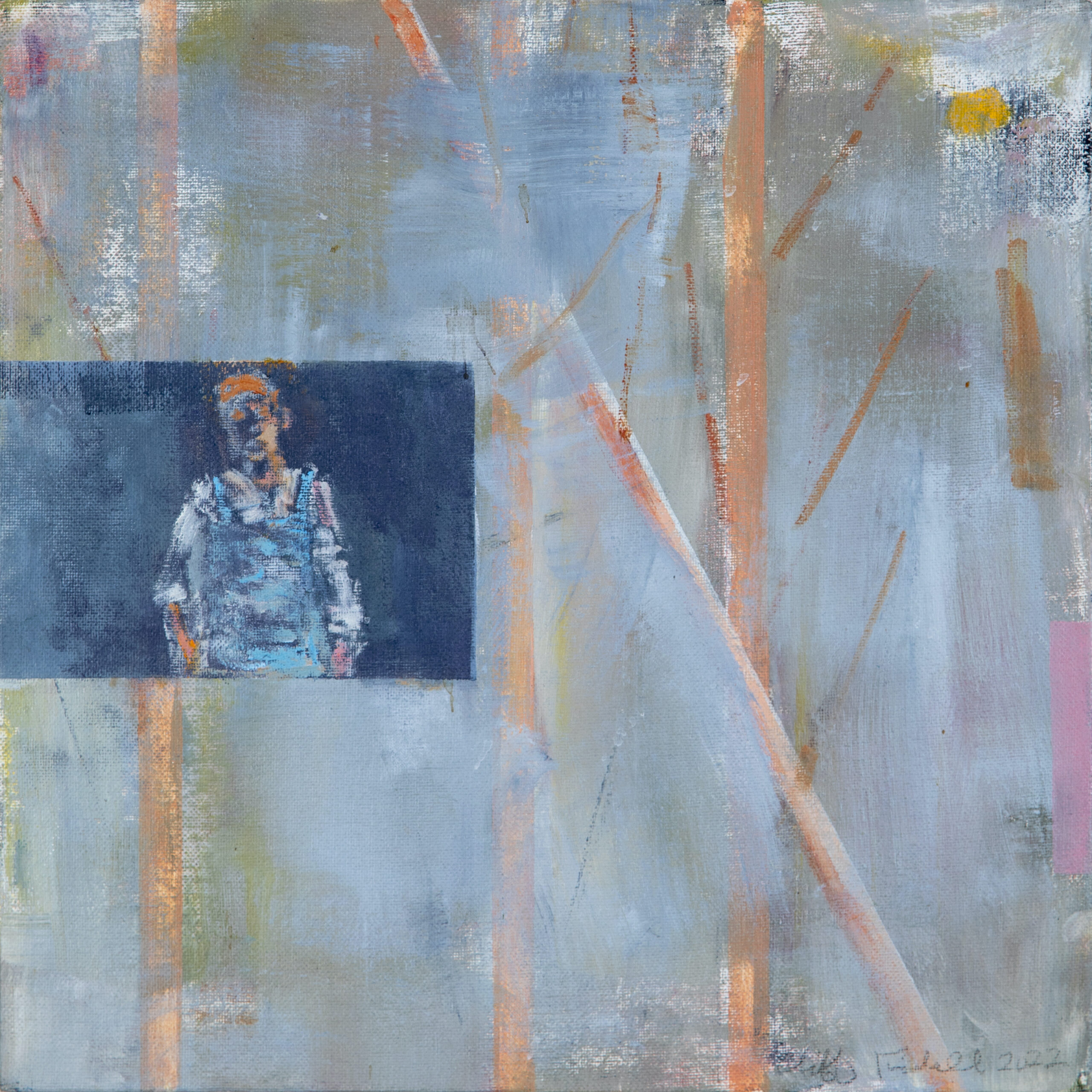
In addition to her home in Nyack, I included her roots in Georgia, and artists she worked with like Julie Harris and Ethel Waters. There’s a lot of darkness in McCullers, which I balance with elements from the natural world: songbirds, blossoms, and trees.

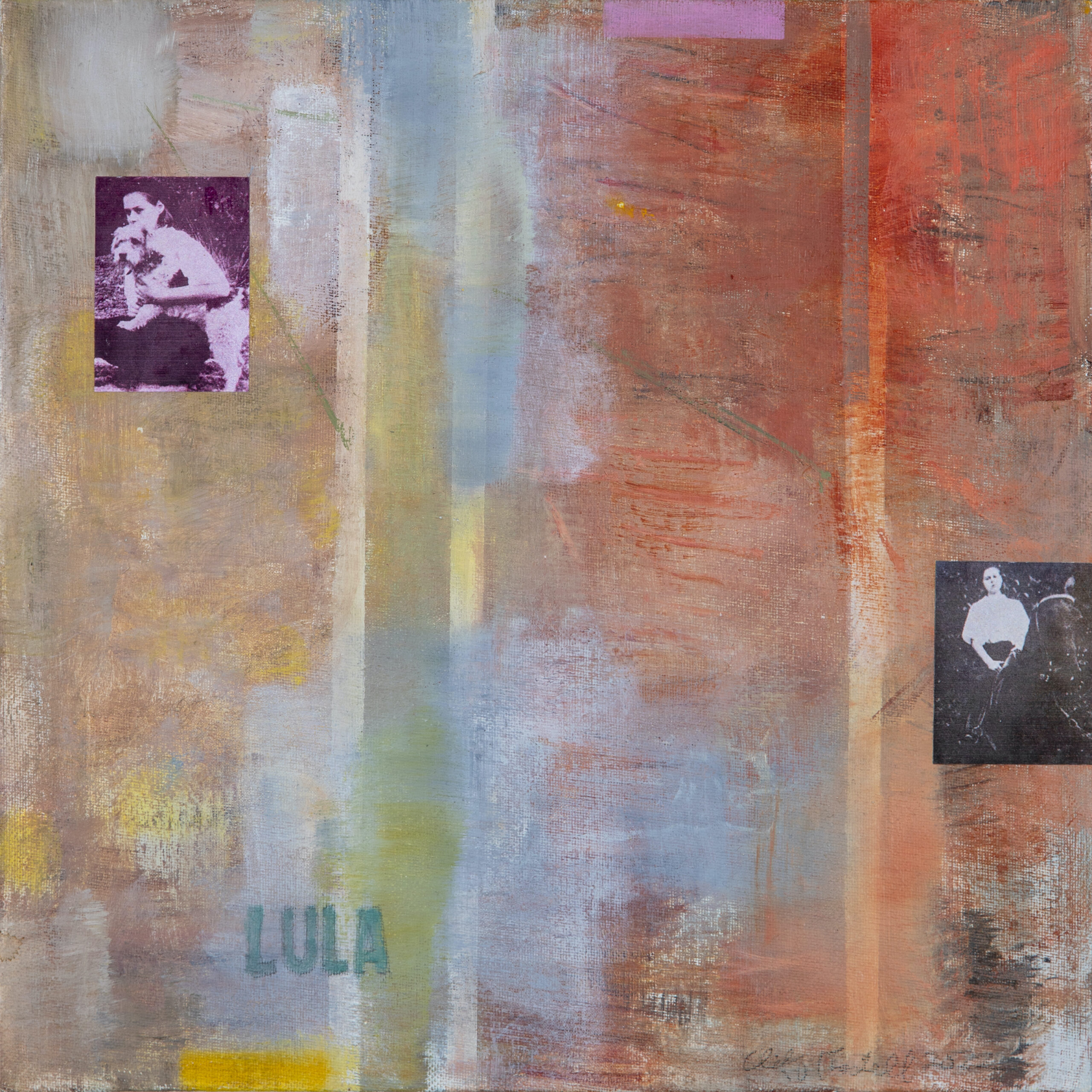
At first glance, this appears to be a collection of works crafted entirely of acrylic and oil paints, but some display an intriguing use of mixed media. Can you tell our readers about how these pieces were made, and about the ways you employ photographic imagery in your art-making process?
I love to mix it up and cross over boundaries of fine art and popular culture. Movies, illustration, and comics all figure in my work. I don’t hesitate to draw from other genres or mediums. Photos of McCullers add a historic quality. Given the small scale of the paintings, it was also a practical choice. These images would have been time consuming to paint by hand, and I don’t think as effective. The images are printed on my inkjet printer, applied to the canvas, and color is added. Handwritten inscriptions are done with pencil.
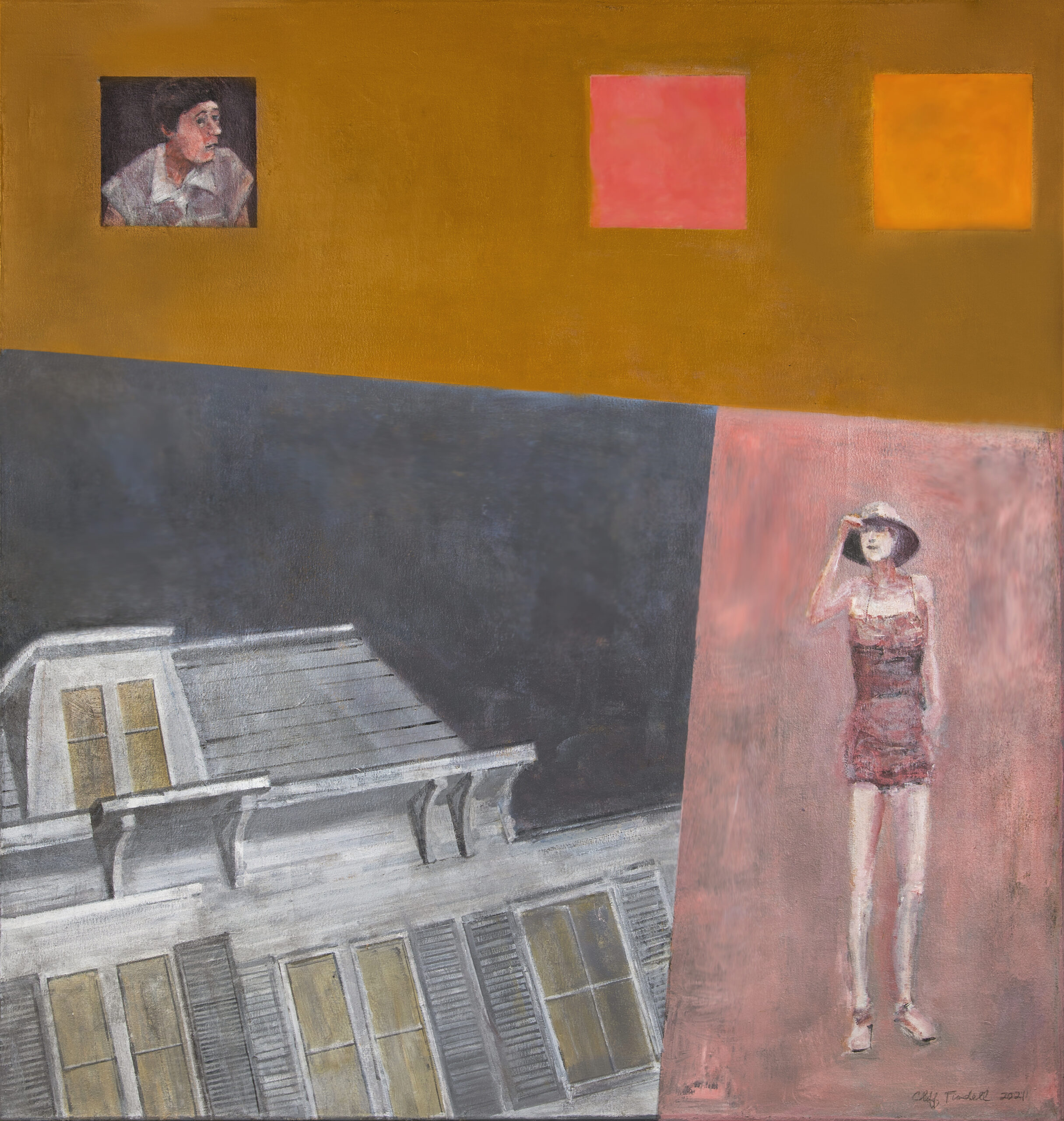
One of the first comments I made to our team here at Blackbird was that your work has notes of collage without actually being collage. I found that reimagining of a familiar technique incredibly stimulating. For me, the most striking difference is the type of tonal energy in your pieces. There’s a calm to the work I don’t usually see in collage, and plenty of room for the viewer’s eye to rest, like you’re encouraging the viewer to take a breath or simply enjoy a moment of repose. The effect is similar to that of flipping through a scrapbook rather than an I Spy book. Can you speak to your approach to composition and the use of space in your work?
Some of what you’re seeing as collage may be how I break up space as panels or strips mixed with images. It’s interesting what you’re saying; to be honest, I never thought of it that way. But you’re right. Several of the paintings look like collage. Silkscreens from the sixties come to mind, or James Rosenquist’s paintings.
I like your scrapbook analogy. I grew up with books, magazines, movie posters, and comics, so I have an emotional connection to print. I still compose with the printed page in mind. Regarding the calmness, I wanted these paintings to have a soft, ghostly quality. Many of the images are painted like duotones, and moody tones dominate. There’s a conscious effort to set up a visual experience for the viewer that encourages pleasurable viewings over a long period of time. I like to think of my paintings eventually hanging in someone’s home or private space, and I want them to be able to spend years looking at a piece and continue to have a strong connection with them.

Your artist’s practice has been influenced by your time working with legendary art dealer Ivan Karp, one of the most instrumental figures in twentieth-century art and a name that can’t be divorced from the American pop art and photorealism movements. How did he affect your trajectory and how does his influence appear in this body of work?
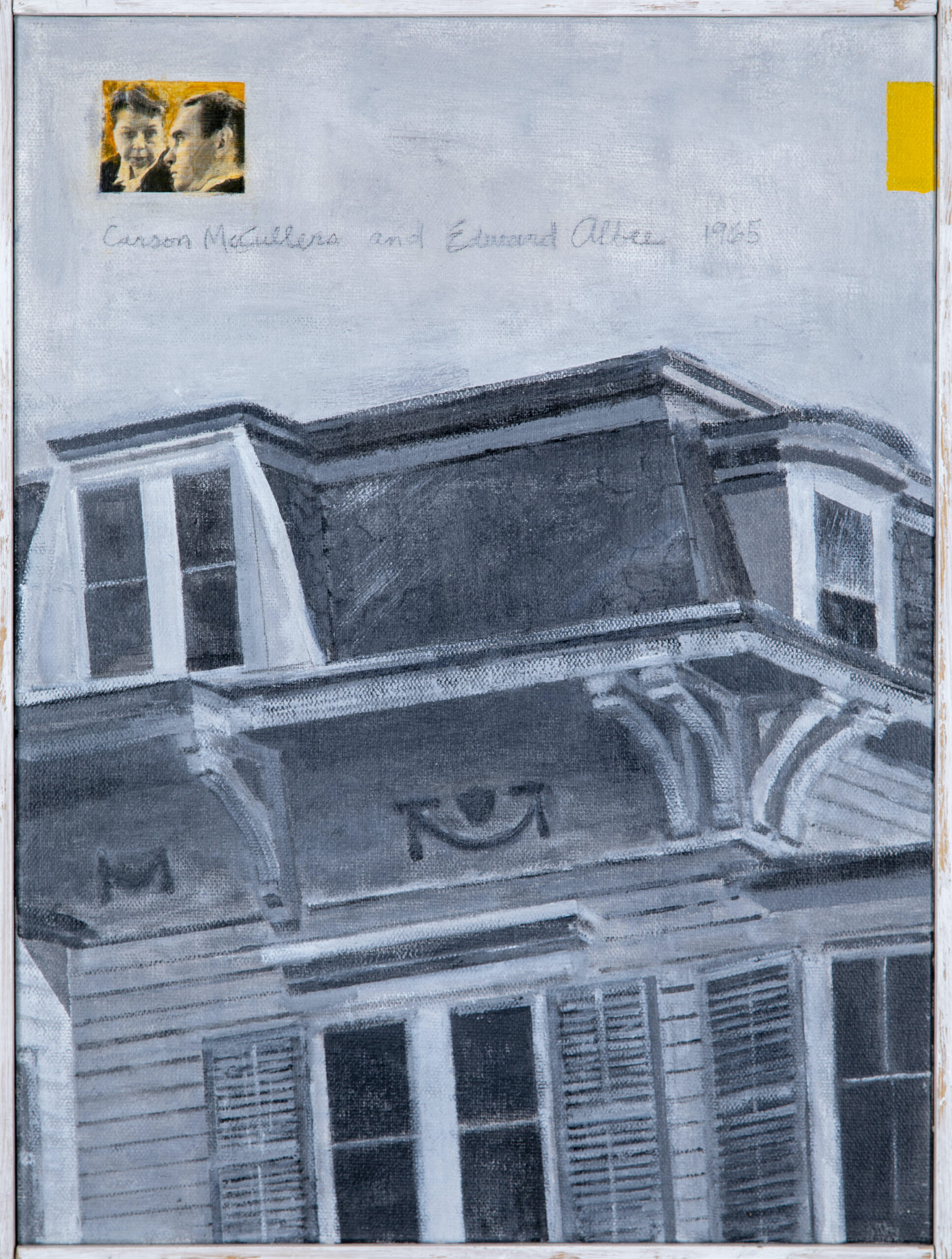
I worked with Karp briefly late in his life. He was one of the only major dealers willing to look at new artist’s work. You could walk into his gallery in Soho and share images of your work with him. He would tell you what he thought. If he liked your work, he would arrange to see more, and if he liked what he saw, he might show your work at his OK Harris gallery. Getting Karp’s approval meant a lot to me, and it was a thrill to have my work shown at his gallery.
Karp was a key figure in the New York art world, especially with pop art. As Karp told it, in the early sixties, when he was director of Leo Castelli’s gallery, Roy Lichtenstein, then an associate art professor, drove to the gallery from New Jersey in his station wagon loaded with his first paintings based on popular cartoons. Castelli was on lunch break, so Karp asked Lichtenstein to prop his paintings up against a wall so he could look at them. Not sure how to react to the work, Karp asked Lichtenstein to leave the paintings. Initially, Karp didn’t know what to make of the paintings. He wasn’t sure if they were to be taken seriously. Castelli and Karp wound up taking a chance and signing Lichtenstein, which was the beginning of the pop movement. Karp was also the first curator to be invited by Warhol to visit his townhouse to see his early paintings of cartoon characters and Coke bottles.
Karp was real New York, a streetwise, cigar-smoking character who knew what he liked, and once committed to an artist, he’d stick with them, even if their work didn’t sell. His insights on art making and the business of art remain with me. He was “first rate,” a term he liked to use if he liked your work.
Tell me about your choices regarding color. I’m struck by something I can only describe as paradoxical in these pieces: you employ incredibly vibrant colors, but the mood they elicit is relaxed rather than bombastic, impactful without ever jarring the eye. I’d love to know more about how you juxtapose, layer, and mix color.
From the start, I saw purples and oranges for these paintings, but I don’t like bright color, so I mixed black and white in to tone them down and create a serious atmosphere. Mood is important to me; it goes back to my early love of the cinema.
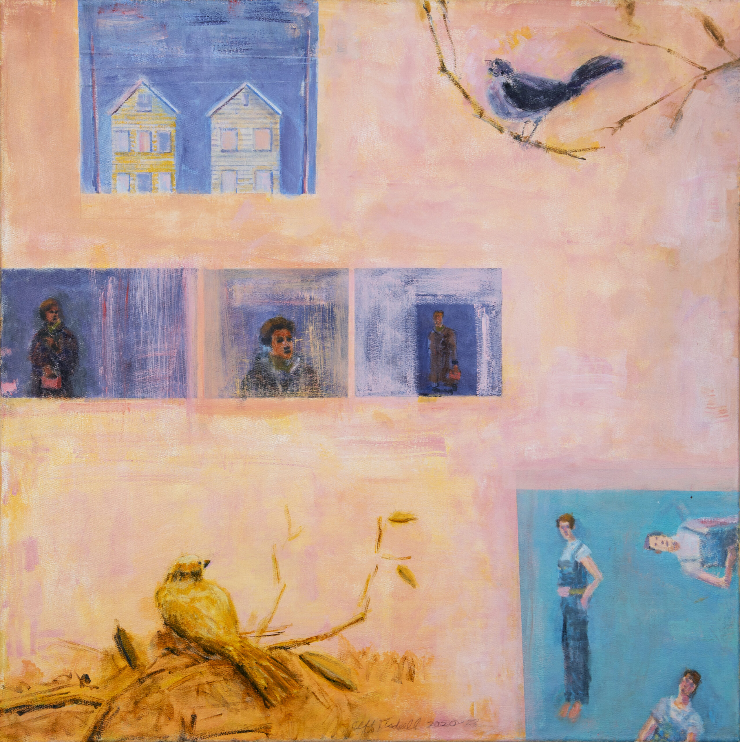
Some of my paintings are done in oil, others with acrylic. I like the different effects of each. With oil, you can get a rich, translucent quality by building layers, but it’s a slow process. With acrylic, I can work faster and get a flatter look. Acrylic or oil, I go back and forth. In some cases, I’ll start a painting in acrylic and then switch to oil. I did that with Berenice.
I also add colored wood trim on several of the paintings to emphasize that they are physical objects. This is a reference to Joseph Cornell’s boxes. Hand-made objects appeal to me. Rauschenberg’s hand-mades would be another example of this kind of approach to art making, or Louise Nevelson’s walls and totems. On a deeper level, these details represents a connection to my dad, who was a woodworker who made “tramp” or “hobo” art.

Alongside your art-making activities, you’re a regular lecturer at the New City Library and DOROT, NYC, where you speak about a wide range of artists and art topics. What motivates your work as a speaker and what are some favorite talks you’ve given?
Ten years ago, I was asked by a couple of curators to give talks. At the time I had not considered speaking about art publicly and was uncomfortable in front of an audience. But after a few talks, I realized I had a knack for it, and people seemed to enjoy what I had to say. Now I value having a forum to share thoughts about art. I prefer oral storytelling in person. I have a series called Talking Art, and I’ve spoken at art centers, religious organizations, museums, schools, senior centers, and libraries.
The talks evolve from questions that interest me, like, How did Picasso survive the occupation of Paris under the Nazis? Or, Is landscape painting still relevant? I’m fascinated by many artists. I like to talk about artists who did wonderful work but are not household names, like Viola Frey, the sculptor of large ceramic figures from California, or the illustrator Richard Powers, who changed the look of paperback science fiction. I do a talk on Jackie Kennedy’s private art collection, which included a favorite painter of mine, Albert York, a reclusive painter from Long Island. Joseph Cornell is a favorite, and yes, I do have a talk on Carson McCullers and my paintings.
Finally, how did working on your McCullers series affect you, and what’s next in your artist’s practice?
Doing my McCullers paintings was an immersive experience done over a period of three years that included a pandemic. I was fortunate to have a fascinating subject to focus on during that challenging period. There’s so much to gain from McCullers. In addition to being a great writer, her world included cinema and the theater.
Now, I continue to explore subjects that interest me. Like my Women in Trouble series and my Growing Up Working Class series. Currently, I’m focused on a series of paintings based on my recent visit to Japan, and I have a new talk on sculptor Louise Nevelson that goes into how her work is deeply connected to her childhood and her experiences in New York City.
