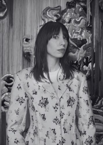
Interview by Megan McDermott
To be a woman and an artist, a woman and a writer, a woman and an academic, a woman and a professional (or fill-in-the-blank-with-something-else-ambitious-or-serious-or-significant) might mean having to contend, at some point, with the idea or label of cuteness. “Cute” can be used to dismiss or diminish someone’s output or presence, especially if there is something about them, or their work, that reads as feminine or young. If a peer here in the creative writing program commented that one of my poems was simply “cute”—well, I probably wouldn’t take that too kindly.
With all that said, there might be things we lose out on—personally and professionally—if we feel pressured to run far away from proximity to cuteness. Certainly we would lose the chance to deeply engage the art of Anne von Freyburg, who looks cuteness in the eye while also doing so much more.
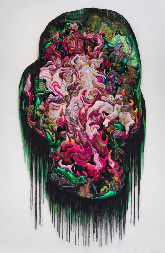
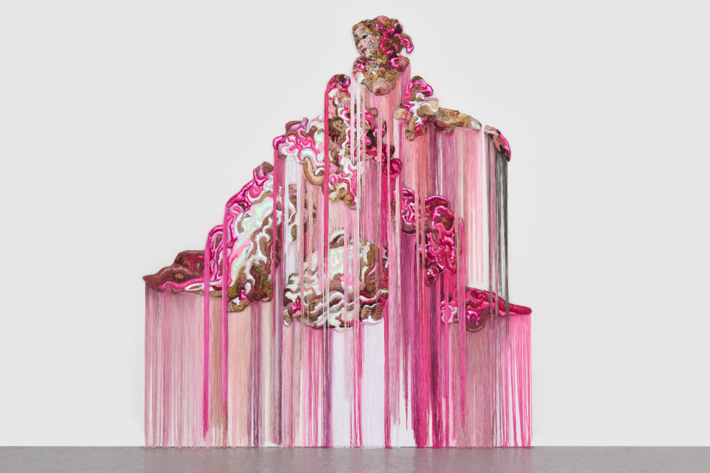
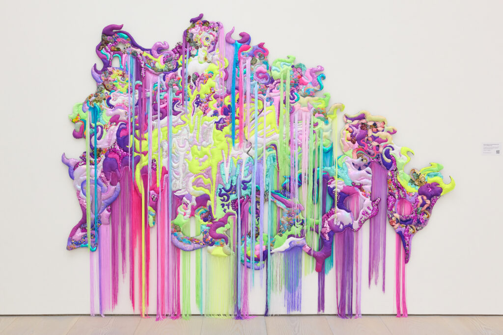
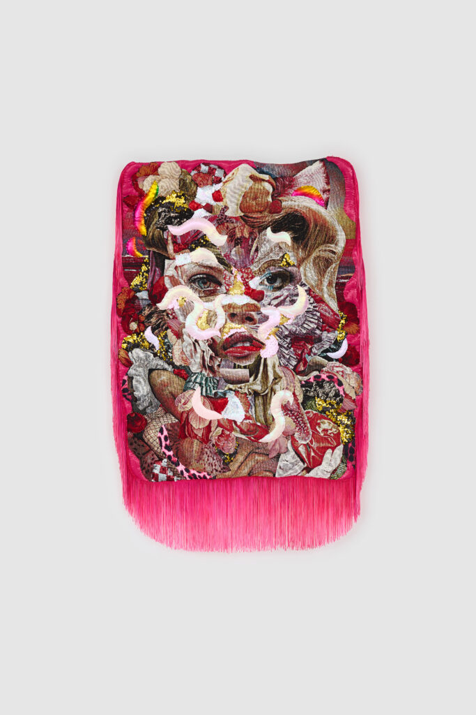
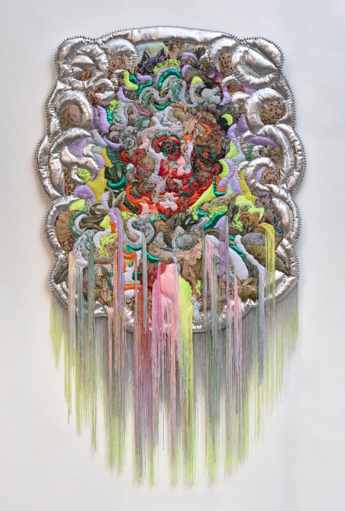
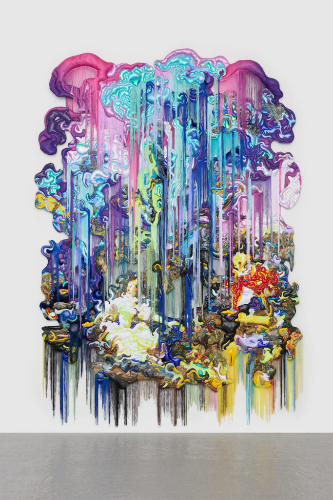
Some of her pieces (which you can see more of in this Flight’s “Gallery”) take inspiration from Jean-Honoré Fragonard and Élisabeth Vigée Le Brun, artists associated with the eighteenth century rococo movement. Rococo paintings often included scenes of love and courtship, gardens, and sumptuous fabrics. They could be called “cute,” especially by contemporary viewers who might be looking for more of an edge. Von Freyburg doesn’t just replicate this rococo mood, but takes it, in all its potential cuteness, and with utmost artistry, allows us to see that cuteness out of control and unbounded.
When I think about her work and her insightful answers to my questions, I think, too, about the aesthetic choices I’ve made in my own self-presentation. Prior to enrolling in Virginia Commonwealth University’s MFA program, I was working full-time in what is still a very male-dominated field: religious leadership. While some of my clergywomen peers feel most powerful in an all-black ensemble (and admittedly I find it chic on occasion), the thought of wearing black clergy shirts every working day for the rest of my life filled me with dread. For me, empowerment would be limited if it meant getting the opportunity to do the work I wanted, but also having to change everything about myself; real empowerment was getting to do that job as me. Fashion—fabric—became imbued with theological significance. My multiple shades of clergy shirts and my pairing of clergy collars with florals and colorful skirts and very cute cowboy boots said something that, for me, a more serious or neutral aesthetic could not.
Femininity is fraught territory, interwoven with experiences of both power and powerlessness; with both self-exploration and outward imposition. I am thankful for artists like Anne von Freyburg who wade into these contradictions and complications and who show us just how serious cuteness can be.
-Megan McDermott, Lead Art Editor

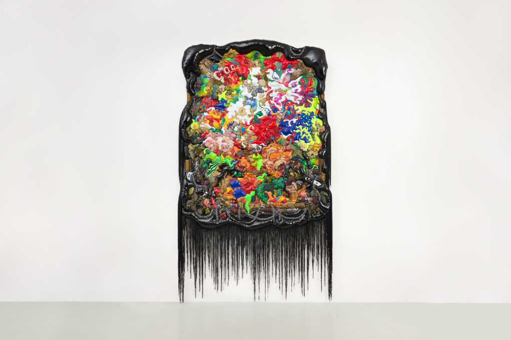
Your pieces often transform the color palettes of the original rococo paintings that inspired them. Sunny Side Up, for instance, introduces a neon element to artwork which, in its original form, doesn’t startle or provoke in quite the same way. What drives your choices around color?
Color is very important in my work as it has been seen as a cosmetic extra, feminine, artificial, dishonest, and there to conceal. Color is associated with irregularity or excess, and therefore can promise liberty and threaten disorder. It is also connected with our childhoods—think of cartoons. Color is connected with the unconscious—it doesn’t need words. When I use color, I think of the body that wears that fabric and the cultural associations I have with this particular fabric in that specific color. I think of color as a way to resist order and normality.
Your work engages with philosopher Simon May’s book The Power of Cute. I haven’t had a chance to read the book yet, but was interested in an excerpt where May talks about cuteness’s “uncertainty” and “transience,” as well as its tendency to blur dichotomies, including gendered binaries. What has been your relationship to the concept of cuteness, both as an artist and as a woman? Has your thinking about cuteness changed through your work on these textile paintings?
What stayed with me from that book is that dressing overtly cute and innocent, like the ‘kawaii’ phenomenon in Japan, is not about being submissive, but to actually be in power. It can be a way to disarm someone. He writes: “Cute…is a teasing expression of the unclarity, the uncertainty, the uncanniness, the continuous flux or ‘becoming’ that our era detects at the heart of all existence, living and nonliving.”
I implemented Cute in my last exhibitions, ‘Filthy Cute’ at Saatchi Gallery London and ‘Amour Toujours’ at K Contemporary Denver as a celebration of indeterminacy and its power to recognize and honor otherness. With the swirly ‘brush’ strokes and cute aesthetics, I wanted to express the being who is in-between, the becoming person and a world in flux. Personalities and identity are fluid, in my opinion. You can be whoever you want and choose to be.
The recent work borrows Cute’s visual language through candy-sweet and vibrant colors. Sparkly and childhood print fabrics are used as a form of disguise. By disarming the viewer with the work’s feminine cuteness and seemingly innocent appearance, I’m asking the question: who’s the one in power? On a personal level, by making this work, I’m reclaiming my own power. The works are full of little nuggets and hidden texts, like, “I Want You” signs, Care Bears, My Little Pony, small candy hearts with “Crazy for You,” and emojis. There is power in being frivolous and seriously joyful/playful. It’s a form of resistance in a time of cynicism and uncertainty.
In multiple interviews, you’ve mentioned an enthusiasm for mashing together aesthetics—particularly what might be classified as “high” art and “low” art. I’d love to hear more about your influences across these different aesthetic registers. What from the world of “fine art” speaks to you? What are some perhaps “lower brow” inspirations—things others may not think of as art at all—that speak to you?
I personally dislike the classification of “high” and “low” art, but art and culture do distinguish between them, so for a lack of better description, I mention them as such. For me, it’s all visual language and equally important. The works are full of art history references. Not just the transformed rococo paintings, but also pop art, the Dutch flower still life, and the modernist drip paintings are in the mix. The use of materials, like colorful sequin fabric, one can view as “low brow,” but as I said, I don’t like to categorize them.
There seems to be a cluster of artists who are working, in very different ways, with rococo artwork as an inspiration, as written about by Katie White and Danielle Thom. To what extent do you think about your work as being in conversation with any of these other artists? What aspects of our current cultural moment do you think might contribute to this particular artistic legacy being reclaimed and reimagined today?
Yes, Katie White interviewed me for this article. I started being interested in rococo back in 2015 when I was doing my MFA at Goldsmiths. Back then, my paintings were already quite richly embellished with beads and textiles. I was interested in this extravagant era on different levels. For instance, that they used cosmetics to cover up disease in their faces. Also, that the art patrons of Boucher and Fragonard were female. That, after the French revolution, women in France were dismissed from being art patrons because of their lack of taste in art. During my time at Goldsmiths, I got some criticism about my use of embellishment and for my aesthetics. I began to see a connection between the visual language of rococo that was being dismissed as bad taste and not taken seriously by art historians and my work. I started using the rococo paintings as a vehicle to challenge these ideas.
The difference for me between painting with textiles and paint is that you can’t escape the realness of fabrics. It’s not so much about escapism, like when you stand in front of a painting. My take on the rococo is more critical than the artists mentioned in the articles above, and, in some ways, even satirical. I don’t want to romanticize this period at all. It’s a very problematic time in history, and it has definite similarities with the times we’re living in today. The rich become richer, and news becomes more fake. Now, you don’t cover up your imperfections with make-up, but with apps and deep fake.
Our team at Blackbird was particularly excited to include your textile paintings that close in on faces, some of which were inspired by the 18th and 19th century artist Élisabeth Vigée Le Brun. What was behind your interest in this particular artist?
With Vigée Le Brun, I chose her portraits of smiling women. I was particularly interested in the ‘smile’ as a form of ‘mask’ to hide emotions behind. However, back in that time, smiling was something outrageous; it was seen as vulgar and very impolite to show your teeth. Le Brun used it as a marketing tool to draw attention to her work when she had to flee to Italy from the guillotine during the French Revolution. I found this story very inspiring in its boldness and cleverness.
I know that we both share a love for Lauren Elkin’s book Art Monsters: Unruly Bodies in Feminist Art. In Art Monsters, Elkin quotes literary critic and writer Hélène Cixous, who says, “If woman has always functioned [within] the discourse of man….it is time for her to dislocate this ‘within’, to explode it, turn it around, and size it; to make it hers, containing it, taking it in her own mouth, biting that tongue with her very own teeth to invent for herself a new language to get inside of.”
Does any of Cixous’s language here—of dislocation, explosion, or biting—align with your own sense of your project as an artist? Where do you find these elements in your work, if at all?
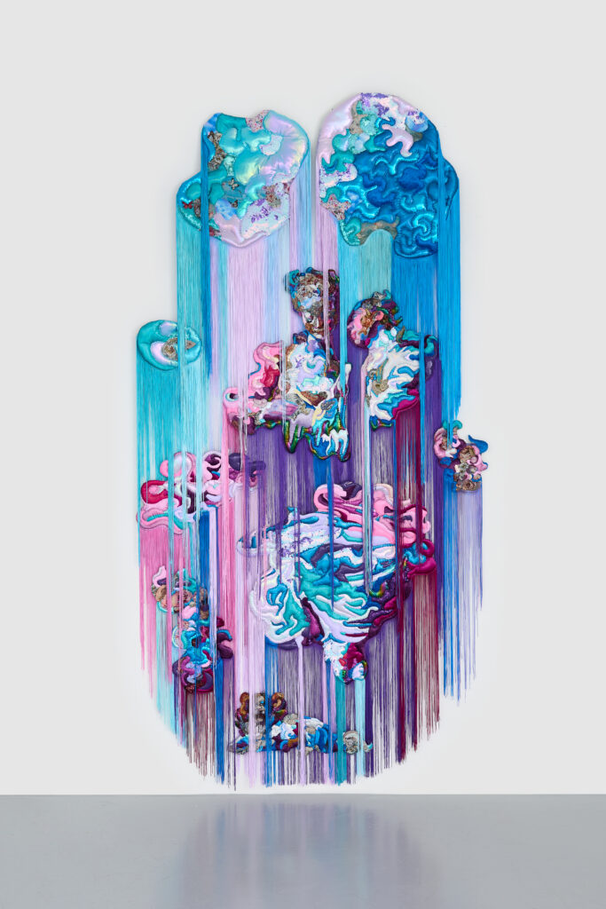
I felt more drawn to these sentences from Elkin: “To become the artist, to paint ourselves into the picture, remake the picture entirely, found a new language, cut it all to pieces, instigate processes of entropy, decreate to create… Go big to claim space. Cut and splice, repurpose, take matter and put it out of place. Unsettle those categories.” I wanted the work to reflect these ideas by being powerful in size, vibrancy and seductiveness, claiming space for the feminine, textiles and individuality.
Lately, I’ve felt very drawn to art, including yours, that intentionally engages materials and imagery associated with femininity, but in a way that presents that femininity as distorted, oozing, messy, imaginative, or surreal instead of docile or conventional. It feels like we’re in a time where poisonous messaging about femininity and its expectations are in a resurgence. See the “tradwife” phenomenon on social media, for example. What are your hopes, if any, for how your work might shift how someone experiences “the feminine,” especially in these times?
These conventional and conservative ideas of femininity are indeed because of the rise of conservatism. I don’t think my work can change these ideas, because the work attracts people that already have an open mind. The work more so functions as something people might recognize themselves in and empowers ideas that are already there. Also, I’d like to say that my work is not merely about female femininity, but femininity in general. I do believe that everything one creates in the world makes a little ripple that may become a wave with the help of likeminded people.