Interview by Josh Galarza
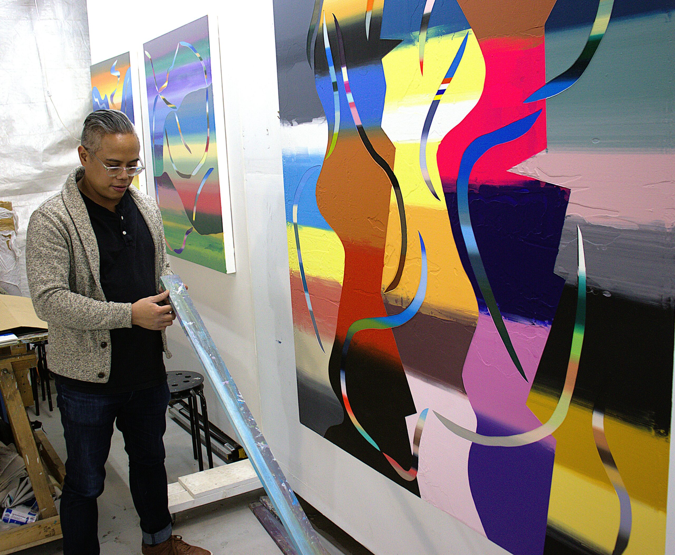
When I agreed to meet painter Roberto Jamora at his studio in preparation for this feature, I couldn’t have imagined where I’d end up. I was climbing a set of rickety wooden stairs, with more than a little trepidation, toward the entrance to a cavernous warehouse in a decidedly industrial part of Richmond, Virginia. This was an area I’d never visited—past the train tracks, under the freeway, through the overgrowth, past this-or-that faded signage. I wasn’t all that far off the beaten path, but I felt lost enough to no longer trust the wisdom of my phone’s GPS. I called Jamora, who assured me I was in the right place. “Give me a sec to come get you.”
Jamora was buzzing with energy when he met me at the door, a precaution necessary to ensure I didn’t get lost on my quest to see his work for the first time. Jamora spoke animatedly as he led me through a maze of rooms, hallways, and segmented spaces hosting all manner of craftspeople, visual artists, and musicians. Turns out this warehouse—which I’d assumed was haunted—was actually teeming with life, each maker partitioned by half-walls and tarps, the occasional block of industrial equipment. Think office cubicles if cubicles were designed by bohemians who need room for their power saws. We could hear a rock band rehearsing somewhere nearby, along with the conversations of other artists.
Another right, a left, and—who knows?—maybe another left, and then we were in Jamora’s studio, it’s walls covered in the works you’ll explore in this feature. The space was brightly lit with clamp lights and the waning afternoon sunshine filtered from a garage door tall enough to back a shipping truck into. Jamora had Googled me—usually my job as the interviewer—and had laid out several screenprints from his undergrad days for me, the printmaker, to peruse. I admit I felt special, and I was thrilled to see them. The throughline to Jamora’s recent work as a painter was apparent, particularly in the inherent layering of printmaking, but so was the energy Jamora first impressed me with. Many of the prints were from a body of work exploring basketball, about as foreign a subject as there comes for a soft, sedentary fellow like me. The juxtaposition of the exuberant thematic content and the method of expression jarred. There was an exciting dose of tension between the static nature of the two-dimensional works and the busy movement of their content. As I glanced from the prints to Jamora’s recent paintings, which popped from the walls with their thick layers of modified acrylic, I couldn’t help but think that maybe Jamora’s practice evolved as it did because two dimensions could never truly contain someone as lively—and alive—as him.
—Josh Galarza, Art Editor

In Personal Effects, you use gradients of color symbolically, relating them to your memories and experiences. Can you tell our readers about the impetus to draw this connection and why color, in particular, became the visual language of this body of work?
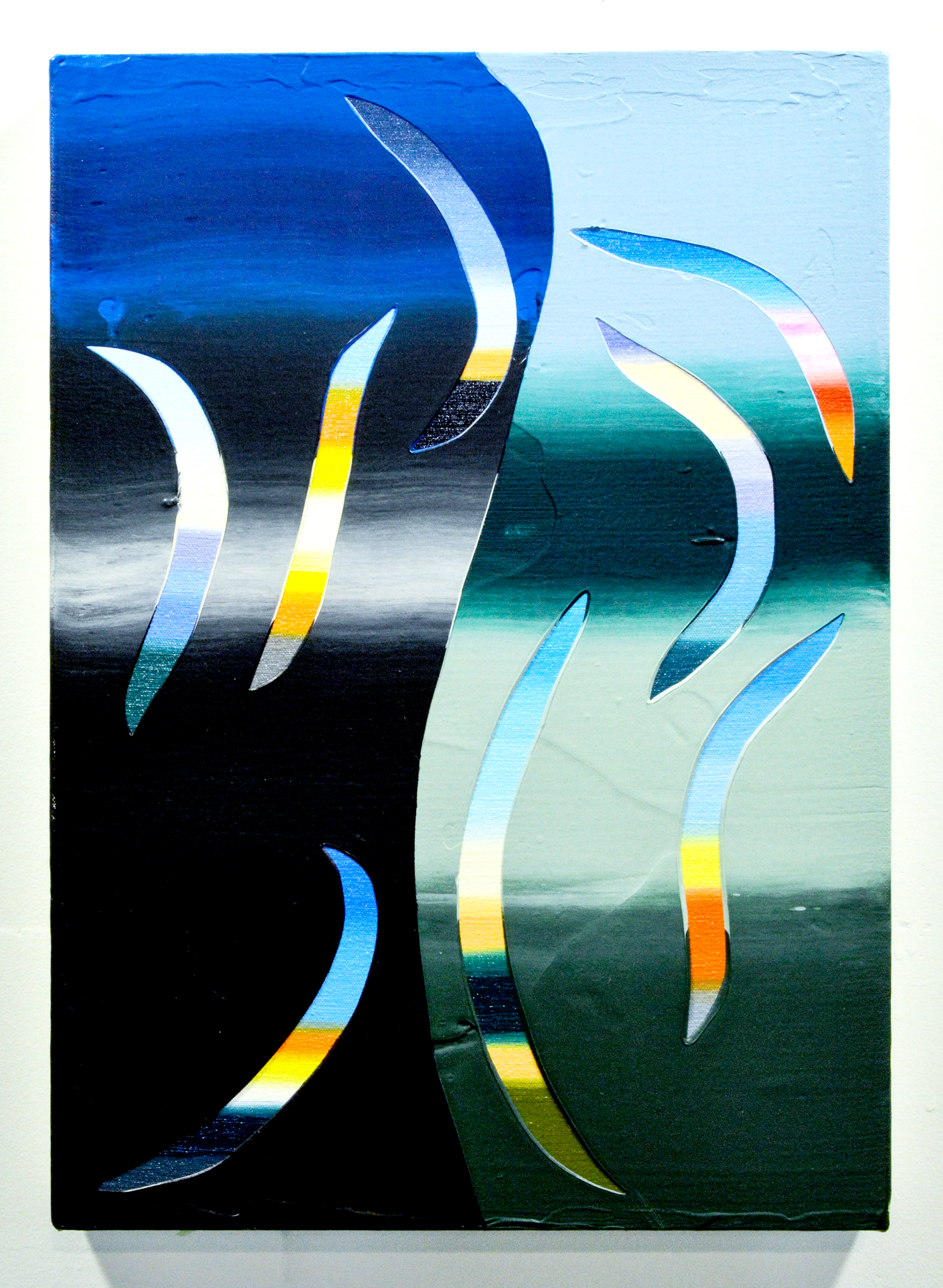
I’m fascinated by how color (even the same color) can hold different meanings depending on context. People, places, and icons are often coded by color in overt and also invisible ways. Because of the potential slippage and mistranslations in meaning, there is a lot to play with in my paintings, even with the pared down visual language. When I teach Surface Research (2D Foundations) courses, I constantly discuss the importance of composition: the visual organization of elements of design, forms, space, and opacity. There is a lot of power in how we organize space. I’m playing with movement, rhythm, tension, and harmony. Some of my paintings include both: a little tension here, lots of harmony over there. Sometimes there is tension all over the place. This reflects the significant autobiographical and social content I’m trying to distill.

Can you speak to how you choose colors for any given piece? The best way I can characterize the interplay is like a dance or a symphony, each palette complimenting, contrasting, and harmonizing all at once.
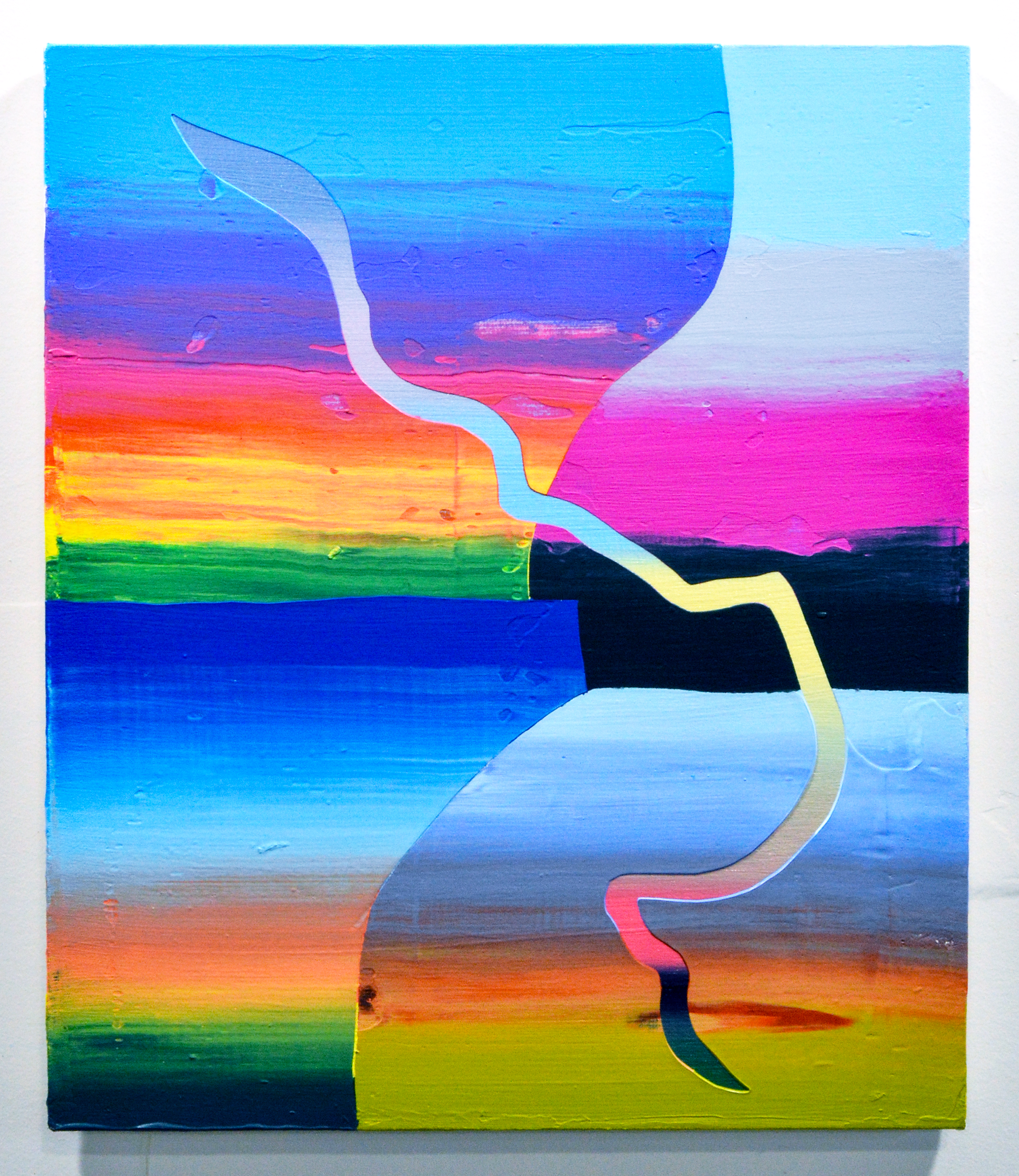
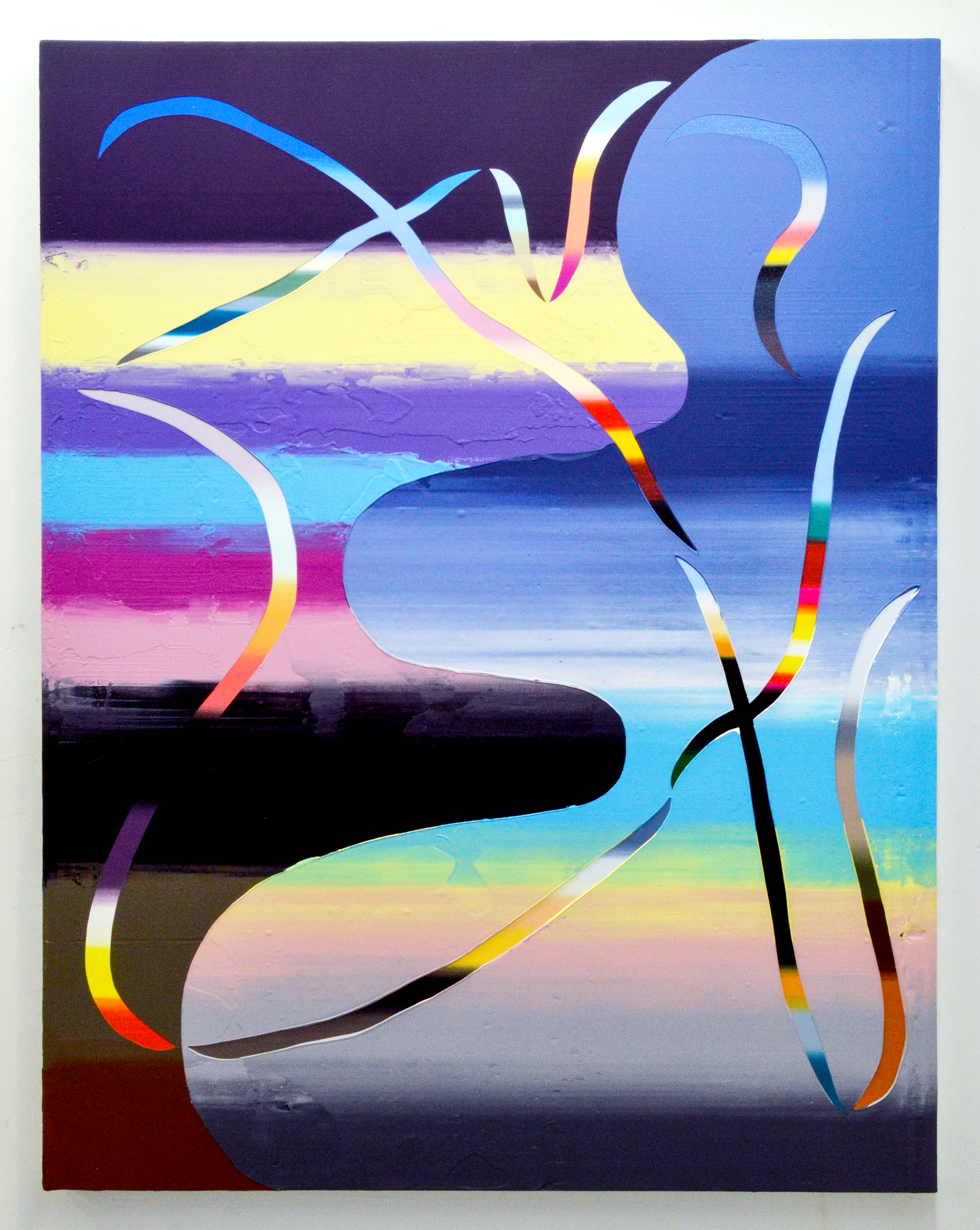
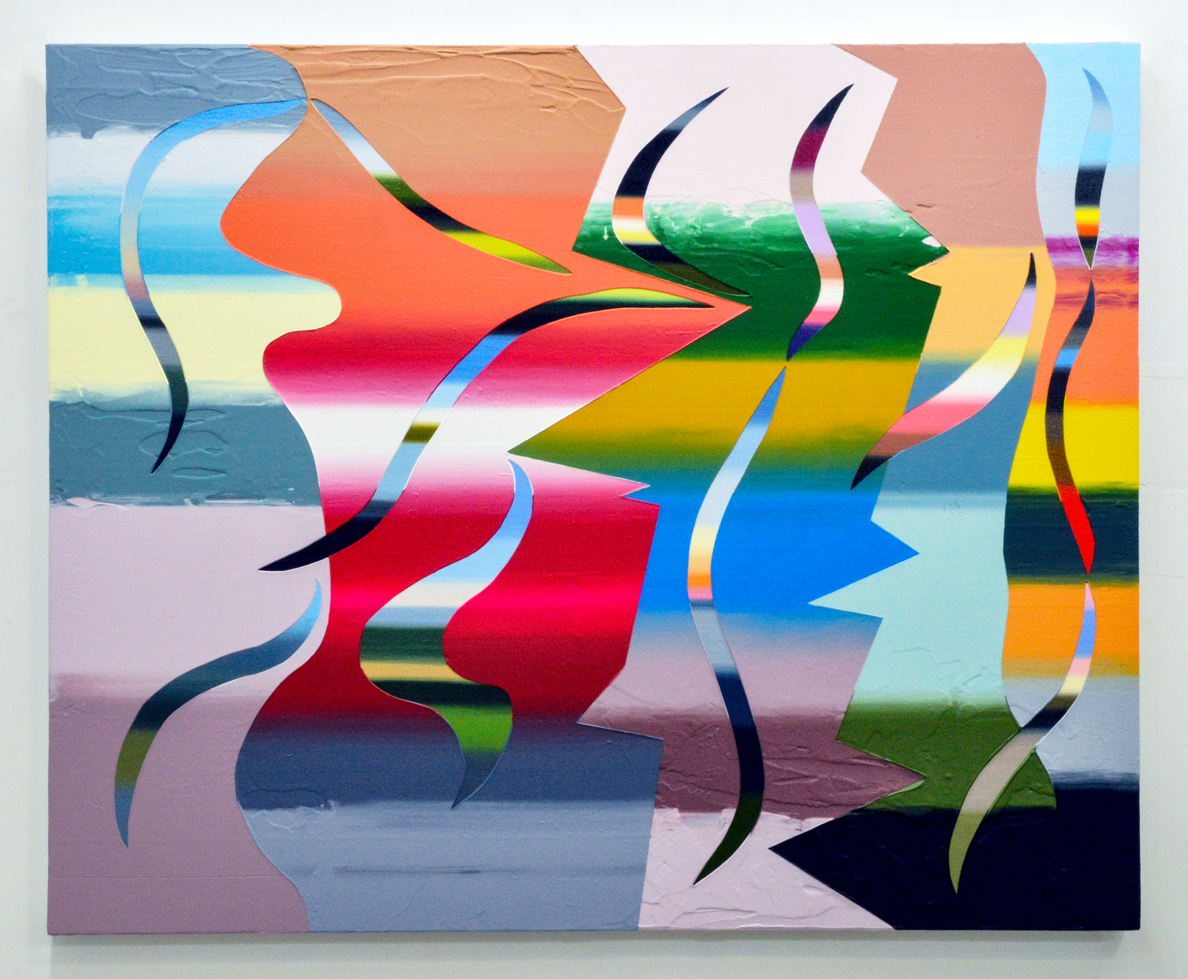
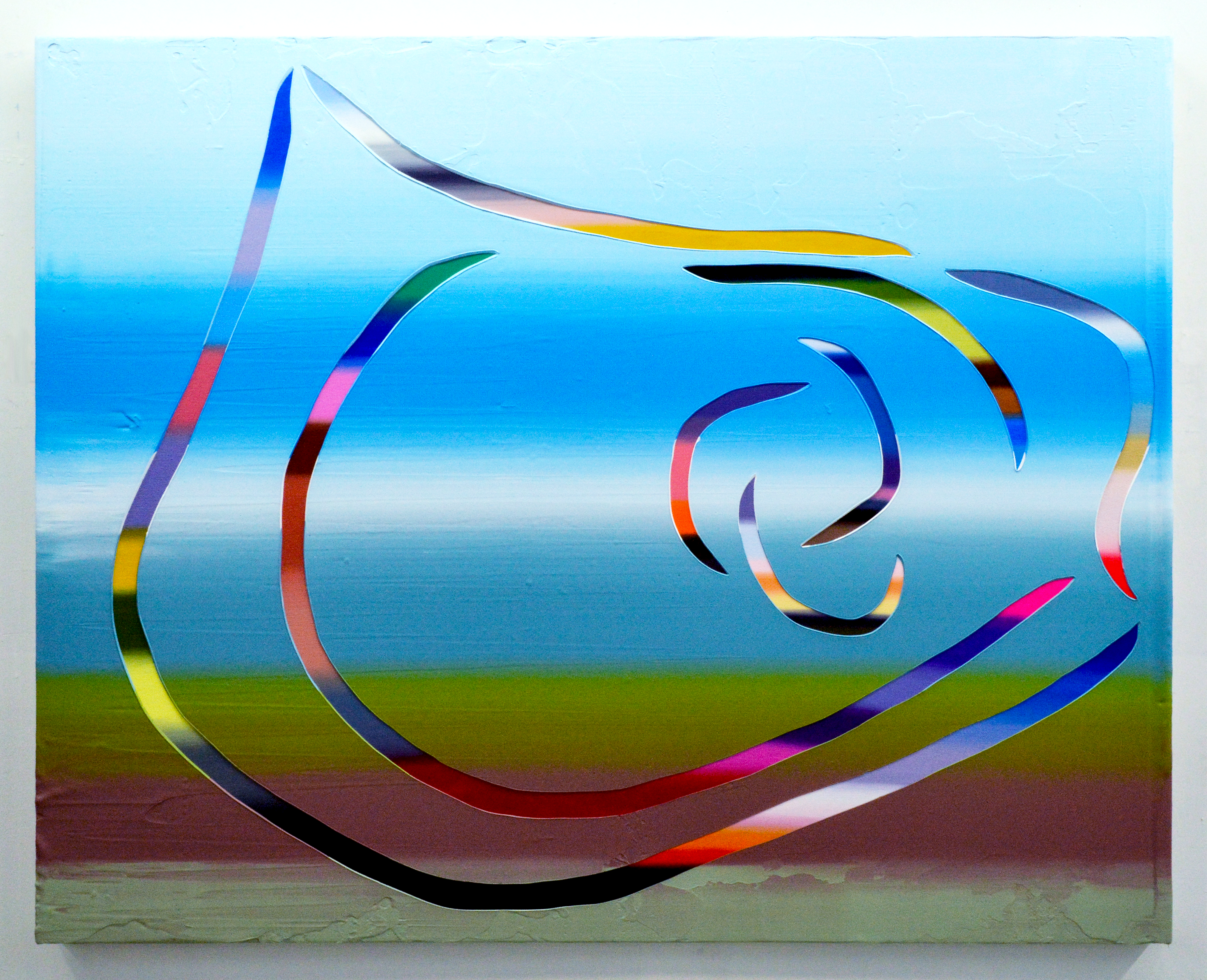
I’m constantly taking photos of everything, sometimes with the intention of using the colors in my paintings, but mostly just to record snapshots of the ordinary and everyday. I organize the colors with a mix of intention and intuition. Sometimes I want the colors to contrast intensely, so I’ll paint, for example, a bright blue next to a tinted, light orange. Sometimes I’ll make sure colors are next to each other that are not very different for minimal contrast. A lot of times, I just see what happens. I’ll let the painting surprise me. The colors in the paintings often allude to places, like in My Ancestral Land (Sorsogon, Bicol) (2023). The colors in the incisions are skin tones of Filipino people in my family and community. The greens are from different plants. The browns are the color of the soil. And I snuck in the skin tone of my wife near the bottom of the painting. I mixed all these colors looking at photos from when my dad took my wife and me on a tour of my family’s ancestral land in the Philippines in 2023. You’ll notice that there are three large, roughly horizontal sections of squeegeed paint. The incision with Filipino skin tones traverses through all three blobby divisions, intersecting only with an incision of the sky at dusk lit by the fires of protest.
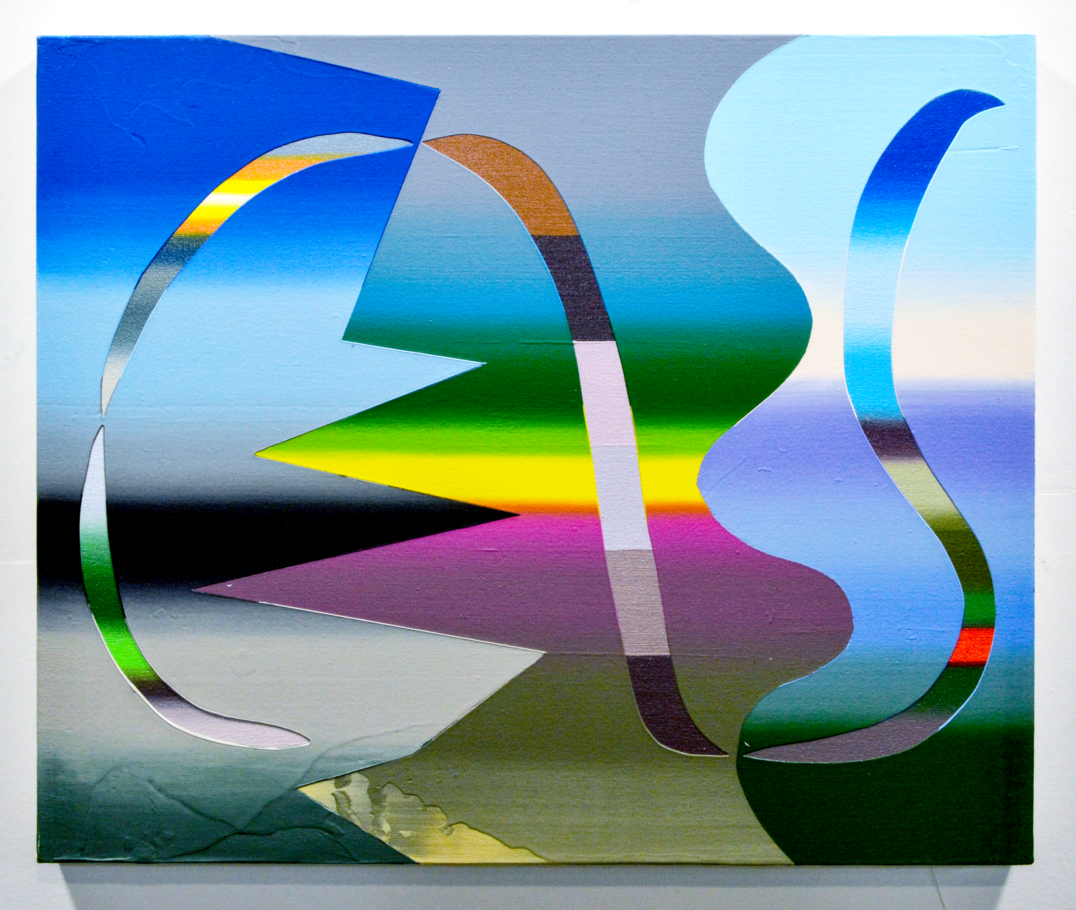

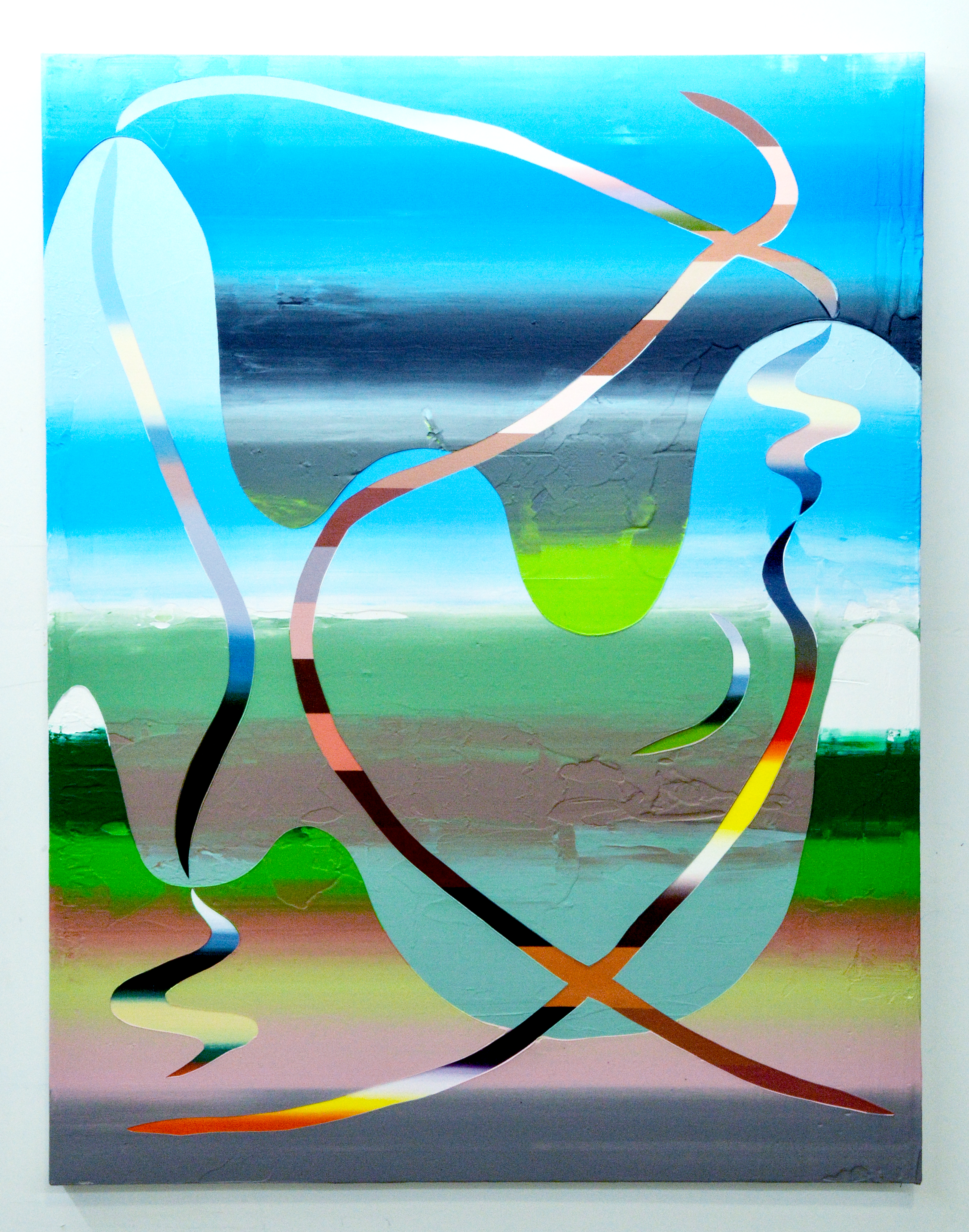
Each of these paintings features two layers of gradated color, the painstakingly hand-painted underlayer—what you call the “incisions”—and the squeegeed overlayer. Can you take us through the production process? I find your use of texture in the overlayer particularly intriguing, and know our readers would love to know more about pumice medium and how it modifies your paints.
Before paint hits the canvas, I draw lots of compositional sketches to plan out the movement—whether I want the painting to be dynamic, static, or broken up into a combination. I also look through photos on my phone and photos from my family’s archive that I scanned in the Philippines. I also paint color from memory, which is a great exercise in futility. The limitation of memory is interesting to me, and I want the paintings to fade in and out of being an abstraction and a nearly palpable image.
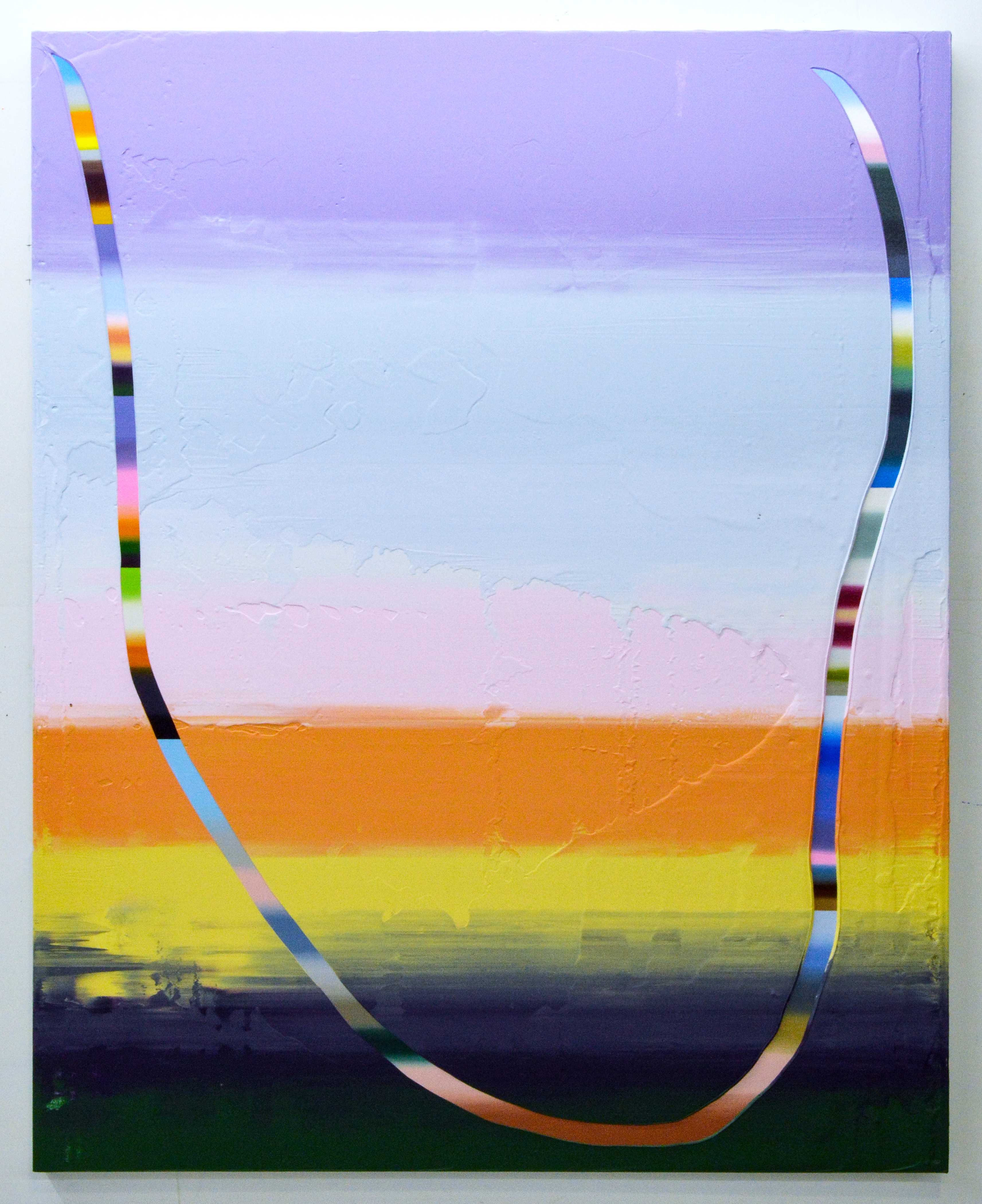
I put all of the photos into Photoshop and isolate the colors to create a kind of blueprint for the painting. Then I map out the composition in graphite on canvas. Finally, the paint is applied. The most time-consuming part of the work is painting the underlayers with a brush. It’s like mixing twelve palettes for twelve separate landscape paintings. Then most of the underlayer gets covered by editing and the top-layer of color. The underlayers are painted with gloss medium. I want them to shimmer like a glossy photo.
As you mentioned, the overlayer is acrylic paint mixed with pumice medium. It thickens the acrylic and holds shape, like oil paint. Its texture is also very matte, creating an intense contrast with the underlayers. Before I squeegee the top layer, I place meticulously cut tape onto the surface of the gradations to form the incisions. The tape is carefully removed after paint is squeegeed across, revealing the underlayers. It’s quite nerve racking, like the old kids’ game Operation.
I used to do all these paintings in oil before the pandemic. When I had to move the studio to my apartment, I had to figure out a solution to keep working without my cat tracking paint all over the place. I experimented with acrylic and loved the intense saturation and range. I really like how quickly acrylic dries, and I like all of the mediums you can add to manipulate the paint’s physical properties, although some of the effects are really cheesy.
About those properties, your processes create a marked interplay between tactile surfaces. The incisions could be interpreted as mark-making—drawing into the thicker surface—even though that doesn’t reflect the reality of how these pieces are made. What guides your choices as you map out your compositions?
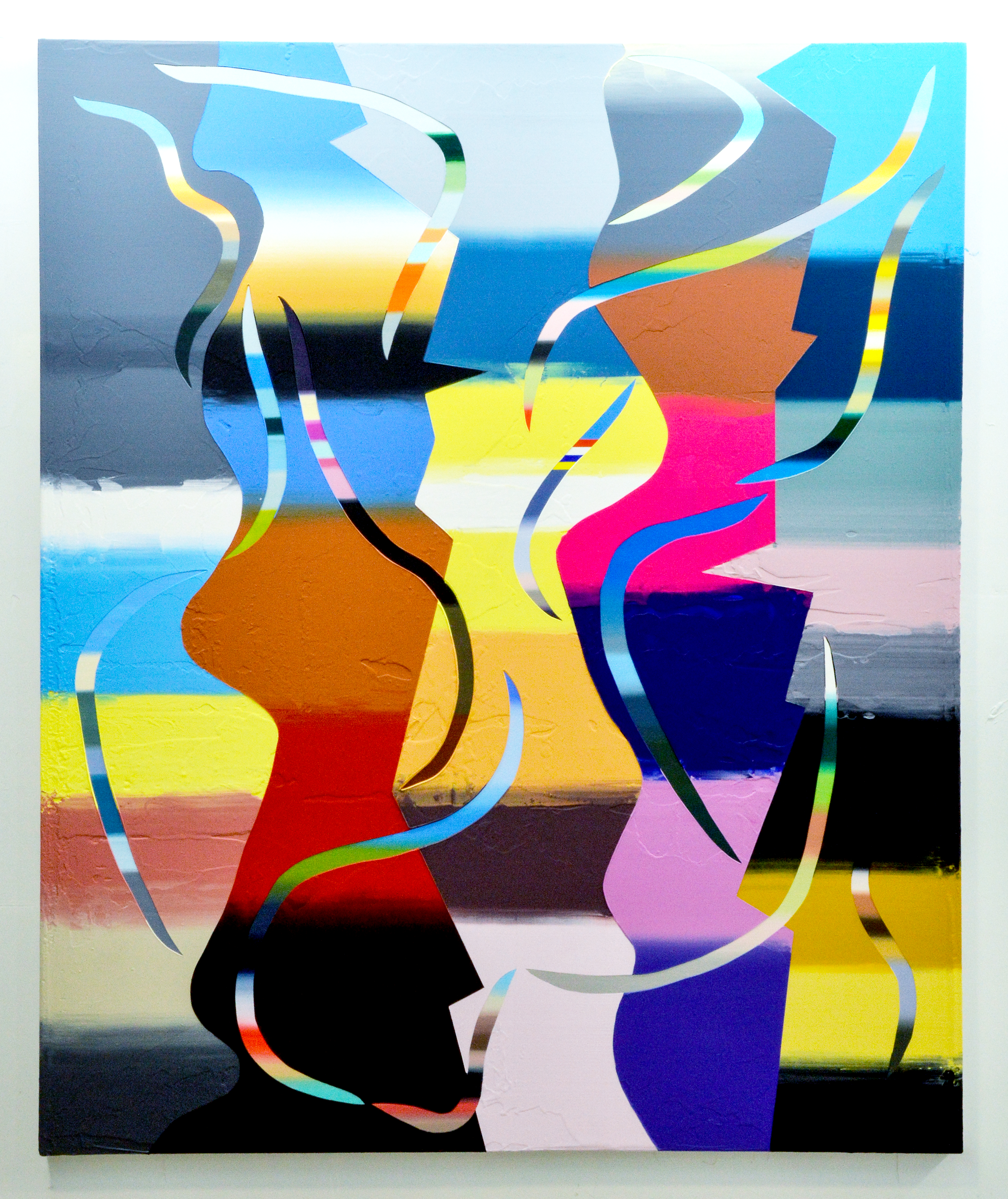
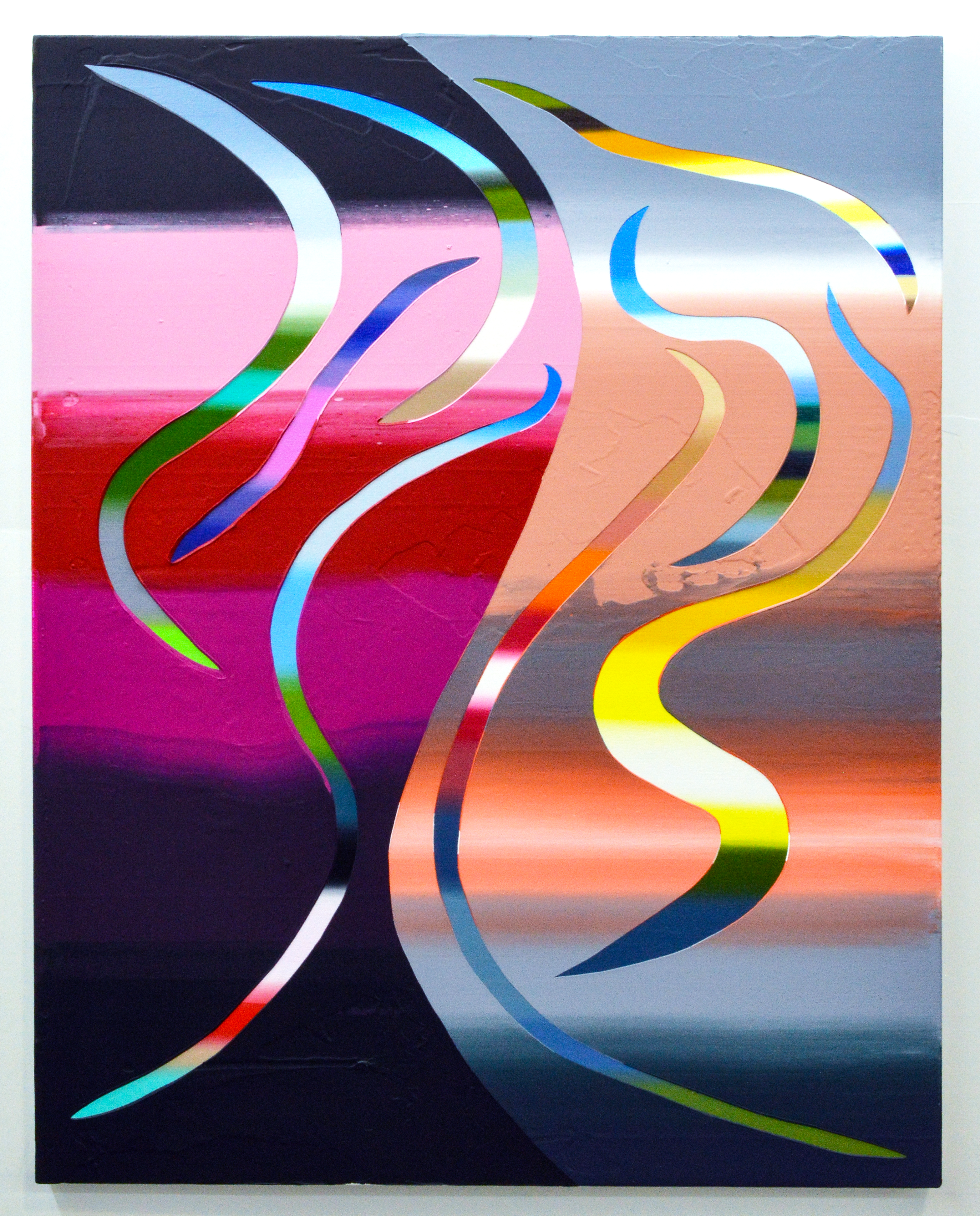
A lot of people see the work and wonder what happens first: the under- or overlayer. The illusion of randomly digging into the surface is a kind of ruse, designed to appear like gestural marks or action painting, when in fact the compositions are somewhat predetermined. Although I do make edits in between applications of paint, a lot of the expressive work is done in my sketchbook ahead of time. Different kinds of tension guide my compositional choices. In The South, where we live (2024), for instance, there are five vertical divisions with lots of contrast created by complementary colors. The incisions tentatively cross into different sections. I made this painting at the Hambidge Center in Rabun Gap, Georgia. I was thinking about how extraordinary the culture, natural beauty, and community is in the American South, but also how extremely divided and vicious this place can be depending on who you are and where you are.
During our studio visit, seeing these works in person, I was struck by the wide variety of sizes. Many of them are large enough to make one feel enveloped when standing up close. How does scale factor into the messages you’re trying to impart or the effect you’re hoping to achieve?
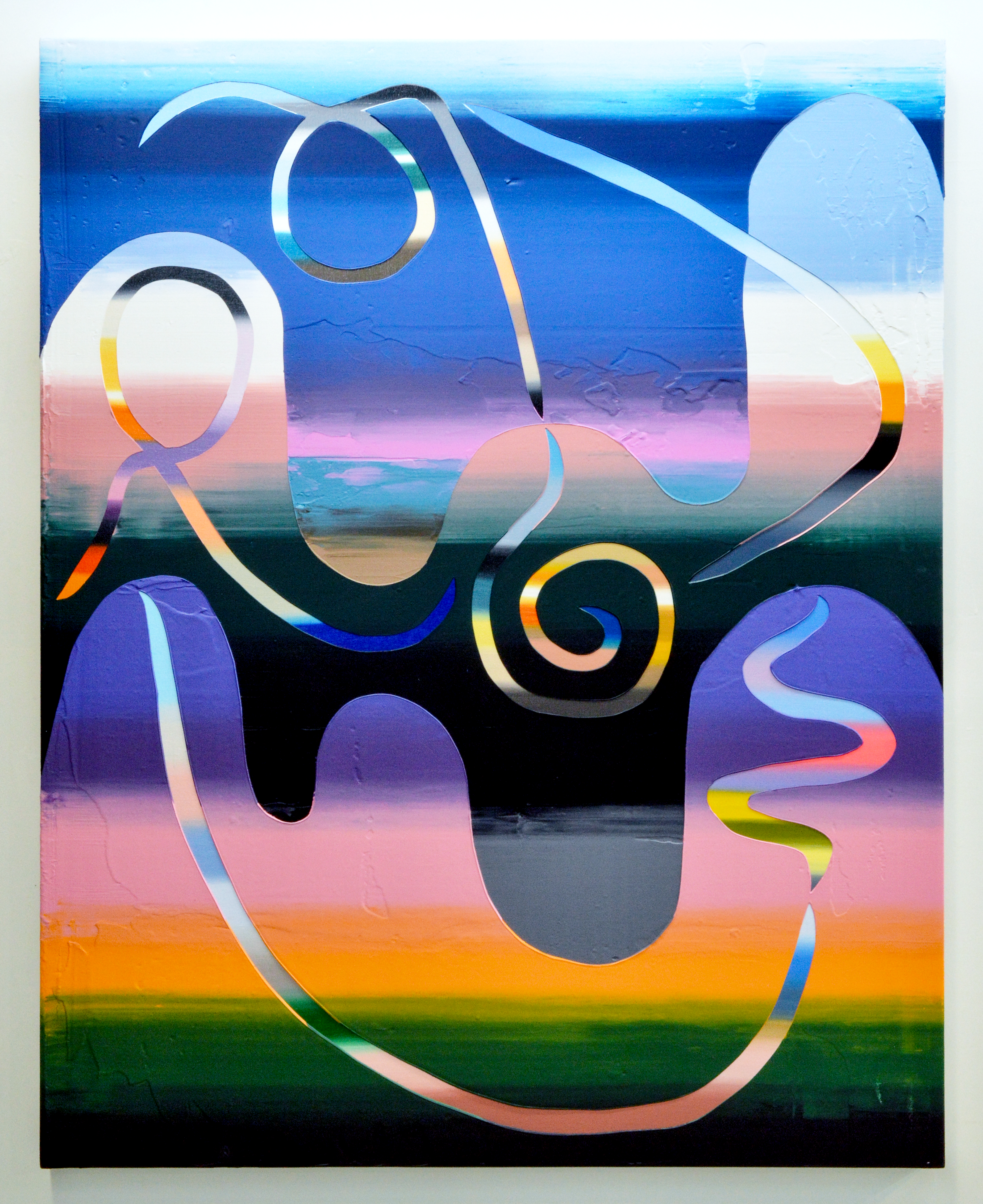
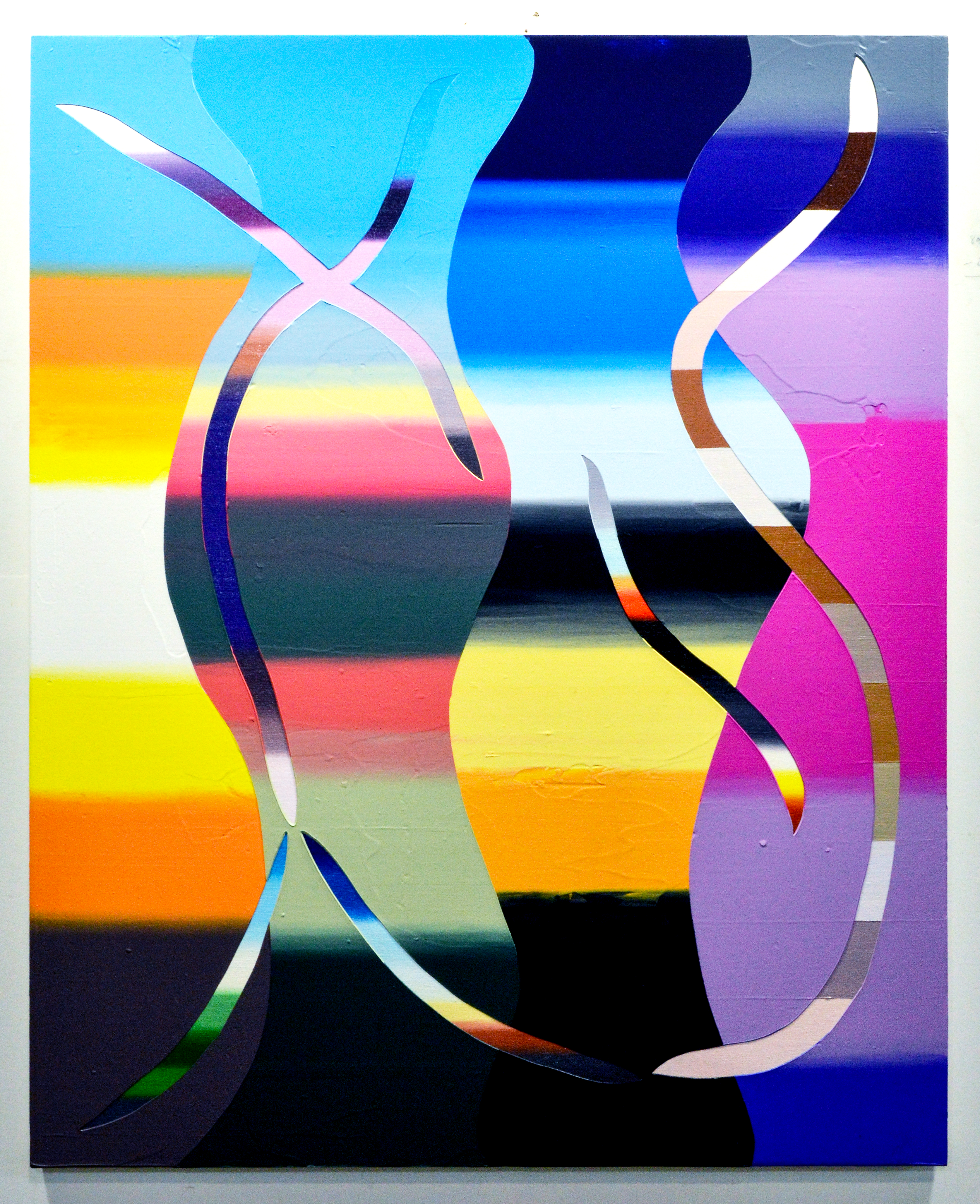
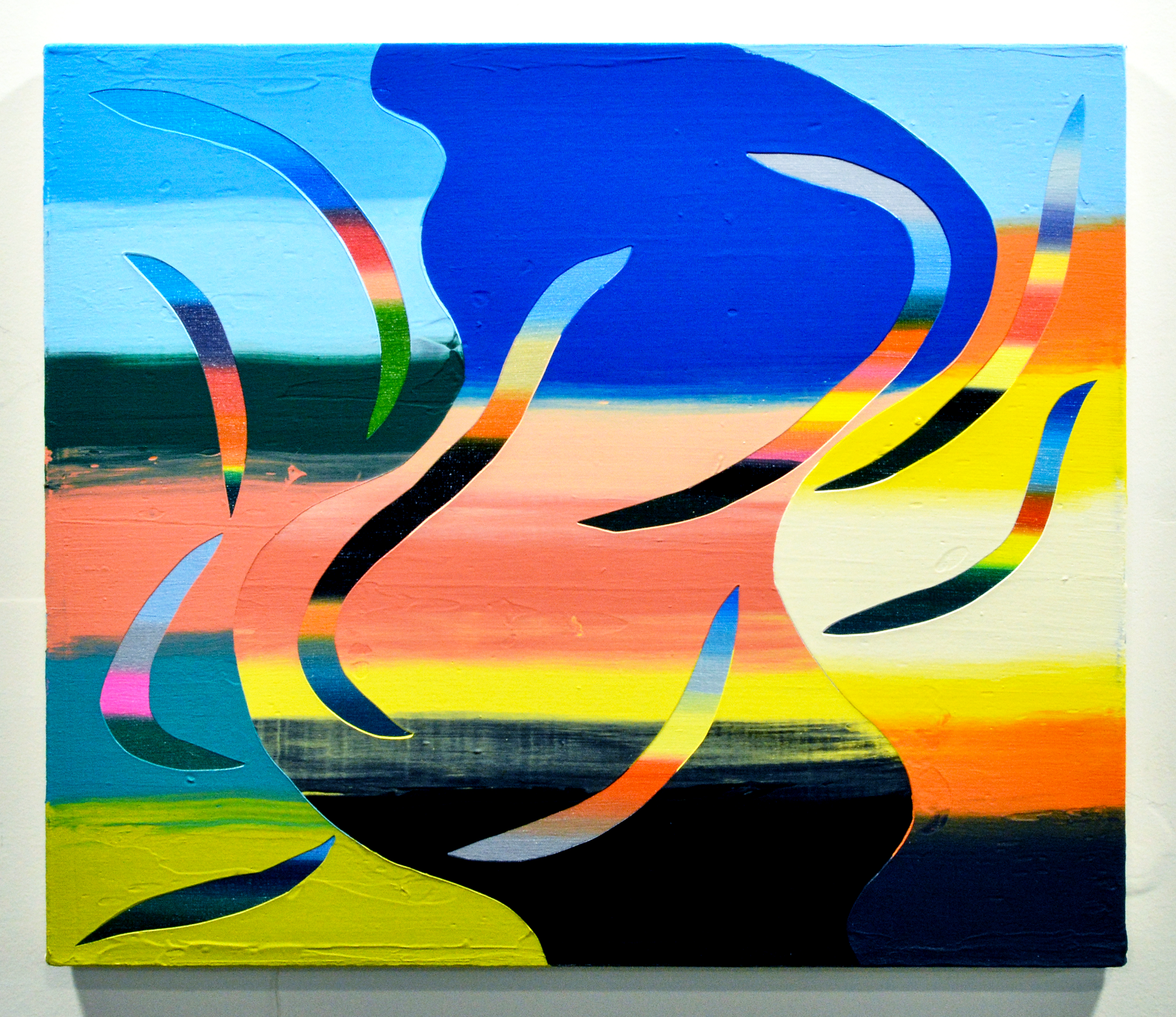
My students—and probably everybody—view art mostly on their phones, which is great, but not the real deal. I want my students to develop an awareness of scale and its power. Tiny paintings require that you stand close and have a more intimate viewing experience without visual noise in your periphery. Large paintings, like you mentioned, can envelope the viewer and call on viewers to physically move their body and tilt their neck to experience the work. In Border Crossers 2 (2023), I wanted to make an enveloping, human-scaled painting. It’s not the biggest painting ever, but it is 5 by 6 feet. It’s a painting that deals with migration and boundaries. Some incisions stay neatly within the boundaries while others cross into other sections, bringing memories of land, people, and perspectives into a new place. A small section of hard-edged colors represents the colors of the Philippine flag.
While these paintings are formally abstract, their concrete titles nudge viewers toward identifiable or relatable subject matter. How do you envision the abstract and the concrete working together in the viewer’s experience?
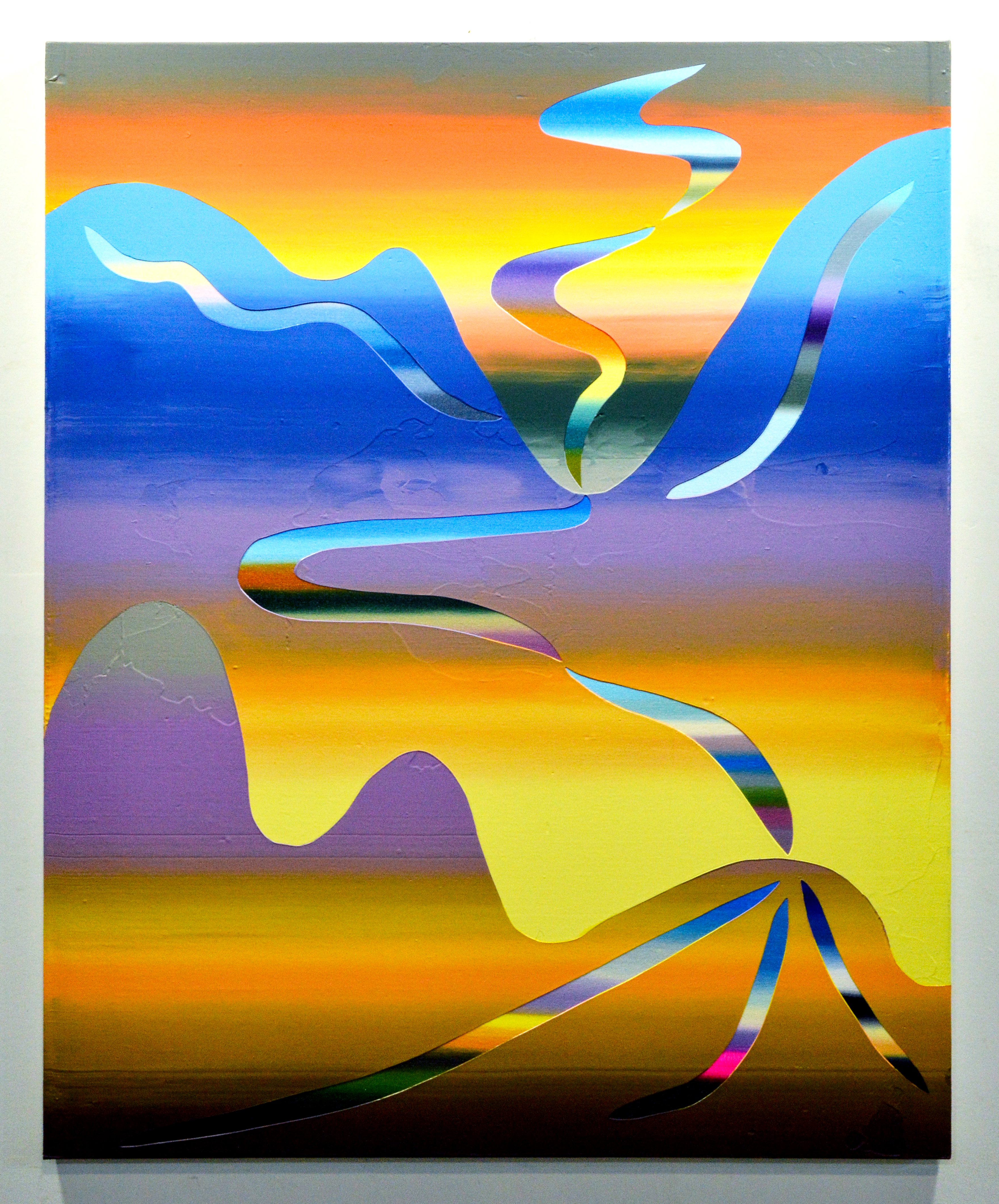
Everything is abstracted somehow—even the most “faithful” representation of a person, place, or thing is changed, even if only slightly. I want people to think about how extraordinary color is and what it can mean. I want the paintings to look playful, because a lot of these paintings are about joy, even though many are based on difficult moments my family and I have experienced. Oftentimes, people will say that a section of a painting reminds them of a place different than what I intended. I welcome multiple readings of the paintings. Sometimes I do want to point people in specific directions, however, like in Neltje’s Ranch (2022), a painting made at The Jentel Foundation in Banner, Wyoming. It’s a region of the country I had never visited before. The light was so epic over there, and I wanted the painting to reflect how grateful I was for the time and space I was gifted at Jentel.
You’ve participated in many artist’s residencies, both in the US and abroad. What draws you to working in new environments and how do these experiences enhance your artist’s practice?
I’ll be at Arte Studio Ginestrelle and Writing Residency in Italy in July, and I’ll be at Cow House Studios in Ireland for two weeks in May. Unless I have shows or commissions scheduled and need to hustle, I definitely spend less time in the studio during the academic year. Residencies are a time for me to focus and kind of heal from the semester, to recenter myself. I like being around people who are deeply immersed in creating visual art, music, writing, food, and so forth, practices that are really different from what I do. I really love learning. This summer, I need to step away from this country. Sounds like I am waxing poetic, but I really need to sit in silence in a room and sit with the boredom and try out new things on my canvases for a little while.
As an intersectional artist and educator myself, I’m always intrigued to learn how others’ ethnicities play—or do not play—into their practices. I note that a significant portion of your teaching and service work at various universities has been under the umbrella of Asian and Pacific Islander experiences. Can you speak to how your identity in the Pilipino-American diaspora guides you as an artist and professor?
My creative research is often intertwined with my teaching and service. I was really lucky to have extraordinary, progressive Filipino mentors, from my time growing up in Virginia Beach to today as a fulltime academic. Street scholars, high school teachers, and senior colleagues modeled what a creative life intertwined with community could be. Big shout out the Filipino American National Historical Society, the Cordovas, the Berganos, Ray Obispo, and Associate Dean Francis Tanglao Aguas at Drexel University. These folks opened doors for me where I didn’t even know the doors existed. Through art and history, these folks taught me about the Filipino diaspora. I give back to the next generation through mentorship to my students and advising student organizations at Virginia Commonwealth University like Asian American Pacific Islander Affinity (AAPIA), Filipino Americans Coming Together (FACT), and Kapwa. With AAPIA, we produce research and creative projects, like the Asian Pacific Islander South Asian American (APISAA) graduation stole donned by the 2025 graduates, which we recently designed, fabricated, and unveiled.
On the first day of all of my classes, I give a short talk about my creative practice and background so my students know what I’m bringing to the table. I’m really straightforward about how my race and ethnicity have shaped my artwork and life in the hope that students interrogate their own identities as a source of strength and meaning. Our identities are something to embrace, not to marginalize. When I taught Filipino Diaspora Studies at William & Mary, a student mentioned something rather poignant, that to understand the diaspora is a kind of exercise in abstraction, because there are so many pieces to put together, so many histories and experiences that stretch across time and space. The Philippines is a really complicated place, and it’s a really difficult place to live in for most Filipino people. Filipinos migrate everywhere for labor. I have cousins, uncles, and aunties in Saudi Arabia, England, Canada, all over the United States, Australia, and Thailand. I think that collective experience is why I am fascinated with structuring all of the vignettes on my canvases non-linearly.